How I Centralized 7 Data Sources Into One AI Dashboard
I built an AI analytics dashboard that pulls GA4, GSC, ads, email, and more into one view. Here's the architecture, the crons, and what it replaced.
By Mike Hodgen
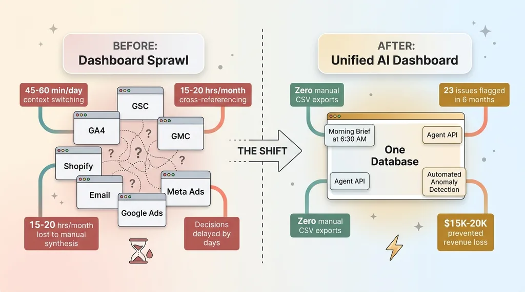
Every morning for about a year, my routine started the same way. I'd open seven browser tabs before my coffee was ready. GA4 in one. Google Search Console in the next. Then Google Merchant Center, Shopify analytics, my email platform, ad dashboards for Meta and Google, and finally the internal operations data from the AI system running my DTC fashion brand. Seven sources. Seven partial stories. None of them talking to each other.
That's how I ended up building a centralized AI analytics dashboard — not because I wanted a prettier view of my data, but because I was drowning in it.
The Dashboard Sprawl Problem (And Why It's Costing You Decisions)
Seven Tabs, Zero Clarity
Here's the thing about having seven data sources open at once: each one is confidently telling you something. GA4 says traffic is up. GSC says your keyword rankings improved. Your email platform says open rates are strong. Great.
 Before and After: Dashboard Sprawl vs Unified System
But is the traffic increase actually driving revenue? Are those ranking improvements on keywords that convert, or just informational queries that bounce? Did the email campaign generate orders, or just clicks that went nowhere?
Answering any of those questions meant manually cross-referencing three or four tools. A GSC traffic spike on a blog post required me to flip to GA4 to check time on page, then to Shopify to see if that page generated any add-to-carts, then to the email platform to check if a campaign had driven that traffic in the first place. By the time I'd assembled the full picture, fifteen minutes had evaporated. For one question.
I tracked this for two weeks. I was spending 45-60 minutes per day just navigating between dashboards and mentally stitching data together before making a single meaningful decision. That's 15-20 hours a month of context-switching, not analysis.
The Real Cost Isn't the Subscriptions
Most people look at dashboard sprawl and see a SaaS cost problem. Too many tools, too many subscriptions. That's the wrong frame.
The real cost is the decisions you don't make. The correlation you don't spot because the data lives in two different tabs. The pricing adjustment you delay by three days because quantifying the impact requires pulling data from four systems. The content strategy that stays stale because connecting GSC performance data back to actual revenue requires a manual spreadsheet exercise nobody has time for.
I wasn't paying too much for software. I was paying with my attention, every single day.
The 7 Data Sources (And What Each One Actually Contributes)
Understanding what I centralized matters, because the value isn't in any single source — it's in what they reveal together.
Traffic & Search: GA4 + Google Search Console
GA4 gives me sessions, conversion rates, traffic by channel, and real-time user behavior. It tells me what's happening on the site right now. GSC gives me the why behind organic traffic — keyword rankings, impressions, click-through rates, and indexing status across 313 blog articles managed through my AI content pipeline. When a GA4 traffic spike aligns with a GSC ranking jump on a specific keyword cluster, I know exactly which content investment paid off. When it doesn't align, I know the traffic came from somewhere else and I need to look at ads or email.
Commerce & Merchant: Google Merchant Center + Deal Engine
Google Merchant Center tracks product feed health, disapprovals, Shopping ad performance, and competitive pricing signals. My internal Deal Engine tracks leads, proposals, and conversion rates across the business. Together, they answer a question neither can answer alone: is a product underperforming because of a feed issue (GMC), a pricing problem (competitive signals), or a lead quality problem (Deal Engine)? That diagnosis used to take hours. Now it takes seconds.
Outreach & Engagement: Email + Ads
The email campaign engine feeds back performance data — open rates, click rates, and critically, revenue attribution per send. Ad platforms (Meta and Google) provide spend, ROAS, CPA, and creative-level performance. Combining these with GA4 session data reveals whether engagement is actually translating to behavior on site. A high-performing email by open rate that drives zero revenue is a completely different problem than a high-performing email that drives revenue but has a high return rate. You only see that by connecting email data to commerce data.
Internal Intelligence: Cortex
Cortex is the internal AI ops layer — part of the 14-skill AI platform running my ecommerce brand. It tracks production status, inventory health, AI system performance metrics, and operational throughput. This is the source most businesses don't have but desperately need: data about how your operations are actually functioning, not just how your marketing is performing. When Cortex shows production bottlenecks on a specific product category, and GMC shows that same category has strong Shopping performance, I know to prioritize production there. That's a cross-functional decision that no single tool surfaces.
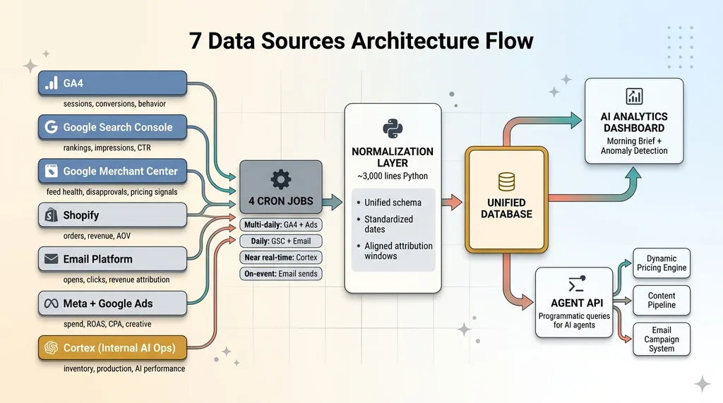
Architecture: 4 Crons, 1 Database, Zero Manual Pulls
 7 Data Sources Architecture Flow
The Cron Schedule
The system runs on four daily cron jobs, each pulling data from different sources on schedules matched to how quickly that data changes and how urgently I need it.
GA4 and ad platform data refresh multiple times per day — these are the fastest-moving metrics. GSC ranking data pulls once daily because Google's own data pipeline has a 24-48 hour delay anyway. Cortex production data syncs near-real-time because inventory decisions can't wait. Email campaign data pulls after each send completes, then consolidates daily.
Four crons. Seven sources. All automated. I haven't manually exported a CSV in over a year.
Normalization: Making Apples-to-Apples Data
This is the part nobody talks about, and it's the part that makes or breaks the entire system.
GA4 calls it "sessions." The email platform calls it "opens." Ads call it "impressions." Each source has its own naming conventions, date formats, attribution windows, and metric definitions. Dumping all of that into one database without normalization gives you a data swamp, not a data lake.
The normalization layer translates each source's metrics into a unified schema. Consistent date ranges. Standardized naming conventions. Aligned attribution windows so that when I compare email-driven revenue to ad-driven revenue, I'm comparing the same 7-day post-click window, not email's 1-day window against ads' 28-day window. This layer is roughly 3,000 lines of Python and it's the most boring, most valuable code in the entire system.
The Agent API Layer
This is what separates an AI analytics dashboard from a BI tool with nice charts.
The system exposes a programmatic API that AI agents can query directly. Instead of me staring at a chart and interpreting a trend, an agent can ask: "What happened to conversion rate this week versus last week, broken down by traffic source, and did any channel show a statistically significant change?"
It gets back a structured answer. Not a visualization. An answer.
This means downstream systems — the dynamic pricing engine managing 564+ products, the email campaign system, the content pipeline — can all make decisions informed by unified, cross-source analytics without me acting as the human intermediary. The dashboard isn't the end product. The Agent API is.
What the Dashboard Actually Surfaces (That Individual Tools Can't)
Cross-Source Correlations
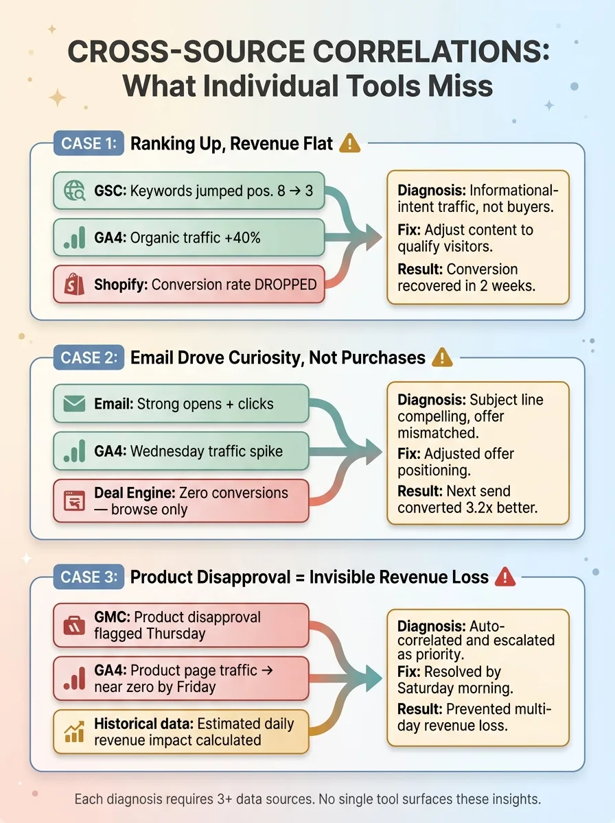
Three real examples from the past quarter:
 Cross-Source Correlation Examples
Ranking up, revenue flat. GSC showed a keyword cluster jumping from position 8 to position 3. GA4 confirmed organic traffic to those pages increased 40%. But Shopify showed conversion rate on those pages actually dropped. The new traffic was informational-intent searchers, not buyers. Without all three data points, I'd have celebrated the ranking and missed the conversion problem entirely. Instead, I adjusted the content to better qualify visitors. Conversion recovered within two weeks.
Email drove curiosity, not purchases. A Tuesday email campaign showed strong open and click rates. GA4 confirmed a traffic spike Wednesday morning. But Deal Engine showed those visitors didn't convert — they browsed, they clicked around, but they didn't buy. The email's subject line was compelling, but the offer didn't match the promise. I adjusted the offer positioning, not the subject line. Next send converted 3.2x better.
Product disapproval = invisible revenue loss. GMC flagged a product disapproval on a Thursday. The unified dashboard automatically correlated this with GA4 data showing that product's page traffic dropping to near zero by Friday. It quantified the estimated daily revenue impact based on that product's historical performance and escalated it as a priority fix. I had it resolved by Saturday morning. Without the cross-source correlation, I might not have noticed the disapproval for days.
Anomaly Detection Across Channels
The system runs anomaly detection across all seven sources simultaneously. It's not just looking for spikes or drops in individual metrics — it's looking for mismatches between sources that indicate something meaningful changed.
Over the past six months, anomaly detection has flagged 23 issues I wouldn't have noticed for at least 2-3 days using individual dashboards. Eleven of those were revenue-impacting. The cumulative value of catching those faster is hard to quantify precisely, but my conservative estimate is $15,000-$20,000 in prevented revenue loss.
The Morning Brief
Every morning at 6:30 AM, a daily summary hits my inbox. It's generated by an AI agent querying the Agent API across all seven sources. It highlights what changed overnight, what's anomalous, and what needs my attention — prioritized by estimated business impact.
Most days, the Morning Brief tells me everything is fine and here's a two-sentence summary. That alone saves me the 45-minute tab-opening ritual. On the days it flags something, I'm already focused on the right problem before I even sit down.
What I Tried Before (And Why It Didn't Work)
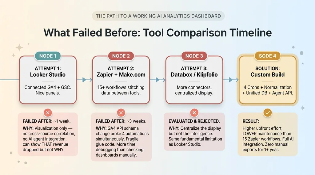 What Failed Before: Tool Comparison Timeline
Looker Studio: Pretty Charts, No Intelligence
My first attempt was Google Looker Studio. I connected GA4 and GSC, built some nice-looking panels, and felt productive for about a week.
The problem is fundamental: Looker Studio is a visualization layer, not an intelligence layer. It can display data from multiple sources side by side, but it can't correlate across them without manual data blending. It definitely can't feed insights to AI agents. It can't tell you why revenue dropped. It can only show you that it did, in a nicely formatted chart.
Zapier Glue: Fragile by Design
Second attempt: Zapier and Make.com workflows to stitch data between tools. This worked for roughly three weeks before a GA4 API schema change broke four automations simultaneously. I spent more time debugging Zapier workflows than I would have spent just checking the dashboards manually.
The fragility of "glue code" platforms for anything beyond simple triggers is a real problem. They're great for "when X happens, do Y." They're terrible for "continuously synchronize seven data sources with different schemas, handle API changes gracefully, and maintain data integrity."
I also evaluated dedicated analytics consolidation tools — Databox, Klipfolio, and similar. They centralize the display but not the intelligence. Same fundamental limitation as Looker Studio, just with more connectors.
Here's the honest admission: building a custom system is significantly more work upfront. But the maintenance burden of code I control and can debug is actually lower than maintaining 15 Zapier workflows that break silently.
The Build vs. Buy Decision for Analytics Centralization
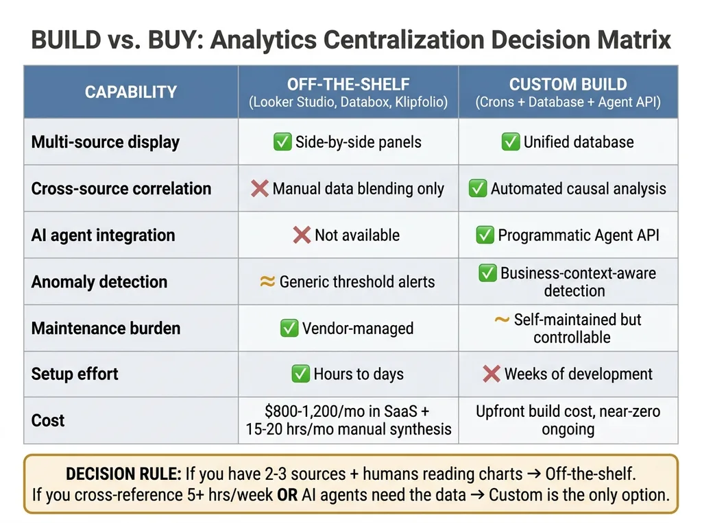 Build vs Buy Decision Matrix
When Off-the-Shelf Works
If you have two or three data sources and just need a combined visual view, Looker Studio or Databox is the right call. Don't overbuild. A marketing team that needs GA4 and ad data in one place does not need a custom analytics pipeline. That would be irresponsible engineering.
When You Need Custom
But the moment you need any of these, you're in custom territory:
- AI agents making decisions from the data — not just humans looking at charts
- Cross-source correlation that goes beyond side-by-side panels to actual causal analysis
- Automated anomaly detection that understands your specific business context, not generic threshold alerts
- A programmatic API so other systems (pricing, content, email) can query analytics directly
The system I built replaced what would have been $800-1,200/month in various analytics SaaS subscriptions, plus the 15-20 hours/month of manual synthesis. More importantly, it enabled a level of AI-driven decision-making across pricing, content, and operations that no off-the-shelf tool provides.
Here's a simple diagnostic: count your data sources. Count how many times per week you manually cross-reference between them. Estimate the time cost. If that number exceeds 5 hours per week, custom starts making financial sense. If AI agents need to act on that data, custom is the only option.
Building This for a Business That Isn't Mine
The pattern I just described — multiple data sources, manual synthesis, decisions delayed by fragmentation — shows up everywhere. The specific sources change. The architecture doesn't.
A financial services firm has CRM data, portfolio performance, compliance reporting, and client communications spread across four platforms. A real estate company has deal flow, market data, investor communications, and property performance in separate systems. A manufacturing business has ERP data, quality metrics, supply chain status, and sales data that never meet in one place.
Four crons. One normalized database. An agent API. A morning brief. That stack works whether you're selling handmade fashion in San Diego or managing commercial real estate across three states.
This is one of the systems I build as a Chief AI Officer — not a one-off dashboard project, but an integrated piece of the AI infrastructure that makes every other AI system smarter. The analytics dashboard isn't the end goal. It's the foundation that everything else builds on.
If Dashboard Sprawl Is Eating Your Mornings, Let's Fix That
I'll spend 30 minutes with you mapping out your data sources, identifying the cross-source insights you're currently missing, and sketching what a unified system looks like for your specific business. No pitch deck, no sales team — just a real conversation about your operations and where AI fits.
Get AI insights for business leaders
Practical AI strategy from someone who built the systems — not just studied them. No spam, no fluff.
Hodgen.AI
Ready to automate your growth?
Book a free 30-minute strategy call with Hodgen.AI.
Book a Strategy Call