Customer Concentration Risk Dashboard: Surfacing the Numbers
How I built a customer concentration risk dashboard for a distributor where most revenue came from just a few accounts and suppliers had no contracts.
By Mike Hodgen
The Two Numbers This Owner Never Put on a Screen
A distributor I worked with had two numbers he carried around in his gut for years. He had never seen either one on a screen.
The first: most of his revenue came from just a few accounts. The second: he resold six products from suppliers he had no contracts with. No exclusivity, no paperwork, nothing.
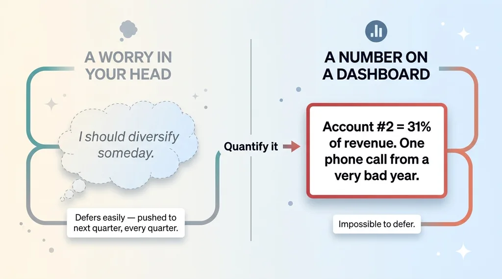
He knew both facts. If you asked him over a beer, he'd have nodded and said something like "yeah, we lean on those big accounts" and "yeah, I should really lock up that supplier." But he had never seen the two numbers quantified, side by side, in dollars. They lived as vague worries, the kind you push to next quarter every quarter.
This is the thing about a customer concentration risk dashboard: the value isn't the math. The math is trivial. The value is that it forces you to look at the number you've been avoiding.
Owners don't avoid their scariest numbers because they're dumb. These are sharp people who built real businesses. They avoid them because nothing forces them to look. The business pays the bills, the big accounts pay on time, the suppliers keep delivering. Why go poke the thing that might ruin your week.
That's exactly the gap AI is good at filling. Not the sci-fi version where a model "transforms" your company. The boring, useful version where software does one thing a worry in your head can't: it puts the number on a screen, color-coded, every time you log in, so you can't defer it anymore.
I've built 15+ AI systems across my own DTC brand and client work, and the most valuable ones almost always do this. They surface the thing you'd rather not confront. This distributor's dashboard was one of them.
Why Owners Run From Concentration Numbers
The intuition trap
This owner "felt fine." And honestly, his intuition wasn't wrong. The three big accounts had paid on time for years. The suppliers always came through. Day to day, nothing screamed danger.
That's the trap. Intuition tracks recent experience, and recent experience was good. Your gut is a moving average of the last few months, not a stress test of the worst case.
So when I asked him what would happen if he lost his number two account, he said "that'd hurt." Hurt is a feeling. It defers easily.
When I showed him the figure, it stopped being a feeling. His number two account was a large share of revenue on its own. Lose it and a meaningful chunk of the business evaporates overnight. You don't defer a number like that.
Vibes don't survive a downturn
Concentration risk is invisible until the day it isn't. It costs you nothing right up to the moment it costs you everything. There's no warning shot. The big account that loved you for six years gets acquired, the new owner has their own supplier, and you find out in an email on a Tuesday.
 Gut Feeling vs Dollar Figure on a Screen
A worry in your head and a dollar figure on a dashboard are not the same object. The worry says "I should diversify someday." The number says "you are one phone call away from losing a large slice of revenue and a very bad year." One of those gets acted on.
Before I built anything for this guy, I spent time just listening to how the business actually worked. I'm a big believer in listening before you automate. If I'd jumped straight to building a generic CRM dashboard, I'd have surfaced the wrong numbers. The concentration risk and the supplier exposure only came out because I asked what kept him up at night and then went looking for the dollar figure behind the worry.
The goal of a good dashboard isn't to make you feel informed. It's to make the risk impossible to keep deferring.
Building the Concentration Risk Widget
Top-accounts breakdown
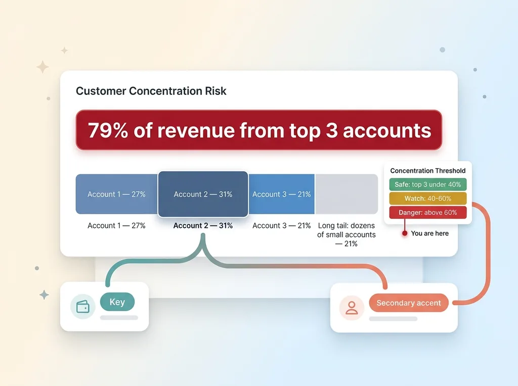
The build itself was straightforward. I put a widget on the home screen of his CRM that ranked accounts by trailing twelve-month revenue, showed each as a percentage of total, and flagged when the top N crossed a threshold.
 Customer Revenue Concentration Breakdown
The concentration figure sat front and center. Color-coded. Green if the top accounts stayed under a safe share of revenue, yellow in the danger zone, red above the threshold. His was deep red the day it went live.
Underneath, each account broke out individually, the handful of big accounts at the top and then the long tail, dozens of small accounts adding up to the rest.
What the percentage actually triggers
The design choice that mattered most was putting this on the home screen, not in a report. I've watched too many businesses pay for "revenue concentration analysis" that lives in a PDF nobody opens after the kickoff meeting. A risk you have to go find is a risk you'll forget about.
To make it work I had to pull revenue data from a few places into one view, the same approach I use when I build centralized analytics from multiple data sources. Order history, invoicing, and account records didn't live in the same place, so step one was getting them into a single source of truth.
One thing I want to be clear about: there's no AI guessing on the numbers here. The math is deterministic. Revenue per account divided by total revenue is just division. I do not want a language model anywhere near a figure that needs to be exactly right.
The AI earns its keep later, in interpreting and acting on what the deterministic math surfaces. The percentage itself is just the percentage. Color it red, put it where he'll see it every morning, and the software has done its job.
The Supply Chain Was the Real Moat, and the Real Fragility
Six products, zero contracts
Here's where it got more interesting. The concentration on the customer side was scary, but it wasn't the scariest number. The scariest number was on the supply side.
This distributor's actual competitive advantage, the reason customers came to him at all, was access to six specific products from specific suppliers. That access was the moat. It's why the big accounts stayed.
And there were no contracts. No exclusivity agreements. Nothing on paper stopping any of those six suppliers from selling direct to his customers or signing up his competitor next week.
The thing that made the business special was completely exposed. That's not a coincidence. In a lot of businesses, the thing that makes you special is the thing most exposed, because it grew out of a relationship, a handshake, a quirk of timing, not a defensible contract.
The one supplier with no fallback
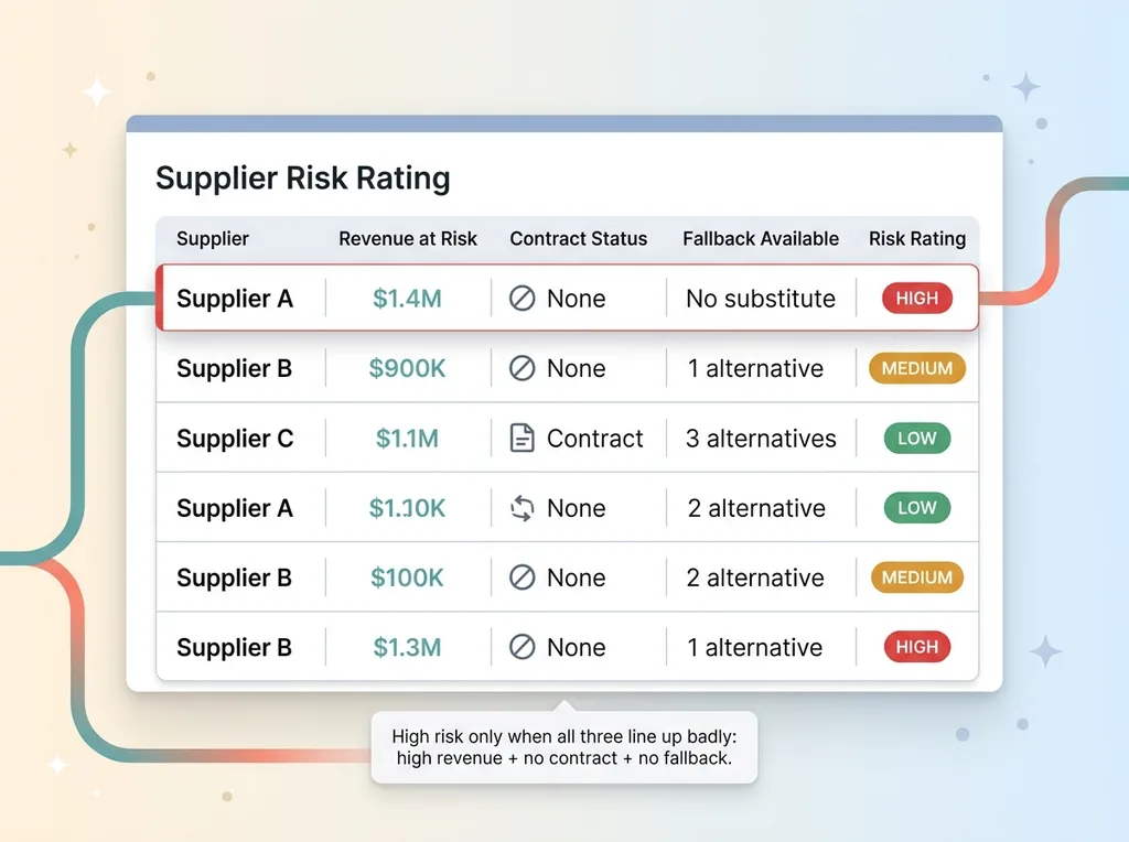
It got worse when we looked supplier by supplier. Five of the six had at least a theoretical alternative. If they walked, he could find a comparable product from somewhere else, painful but survivable.
One supplier had no compliant fallback at all. Their product had specifications his customers required, and nobody else he'd found could meet them. If that supplier decided to go direct, a meaningful chunk of his catalog simply disappeared, with no substitute.
He knew this, sort of. He'd have told you that supplier was "important." But "important" and "this single relationship with no contract is load-bearing for the whole business" are very different statements. One of them you can ignore. The other one you can't, once you've seen it written down.
Putting a Dollar Figure on Each Supplier
Revenue-at-risk per supplier
So I did the same thing on the supply side that I'd done on the customer side. For each supplier, I calculated revenue-at-risk: how much revenue evaporates if that supplier walks or starts selling direct.
This is the move that converts vague worry into a number you act on. "That supplier is important" became "a significant share of trailing revenue depends on this relationship, and there's no contract behind it." You feel a sentence like that differently.
We mapped every product back to its supplier, summed the trailing revenue per supplier, and ranked them. The supplier with no fallback wasn't even the largest by raw revenue, but it shot to the top of the priority list once we factored in that there was no substitute.
Risk ratings that mean something
Raw dollars weren't enough on their own. A supplier could represent a lot of revenue but be low risk if you had a contract and three alternatives. So I built a risk rating that combined three things: criticality (how much revenue depends on them), contract status (locked up or handshake), and fallback availability (can you replace them).
 Supplier Risk Rating Matrix
A supplier scored high only when all three lined up badly. High revenue, no contract, no fallback. That combination is the one that ends businesses, and now it had its own row at the top of the list, flagged red.
The point of dollarizing and rating everything is forcing prioritization. You cannot fix six supplier relationships at once. You don't have the leverage or the hours. But you can see, instantly, which single relationship to lock down first.
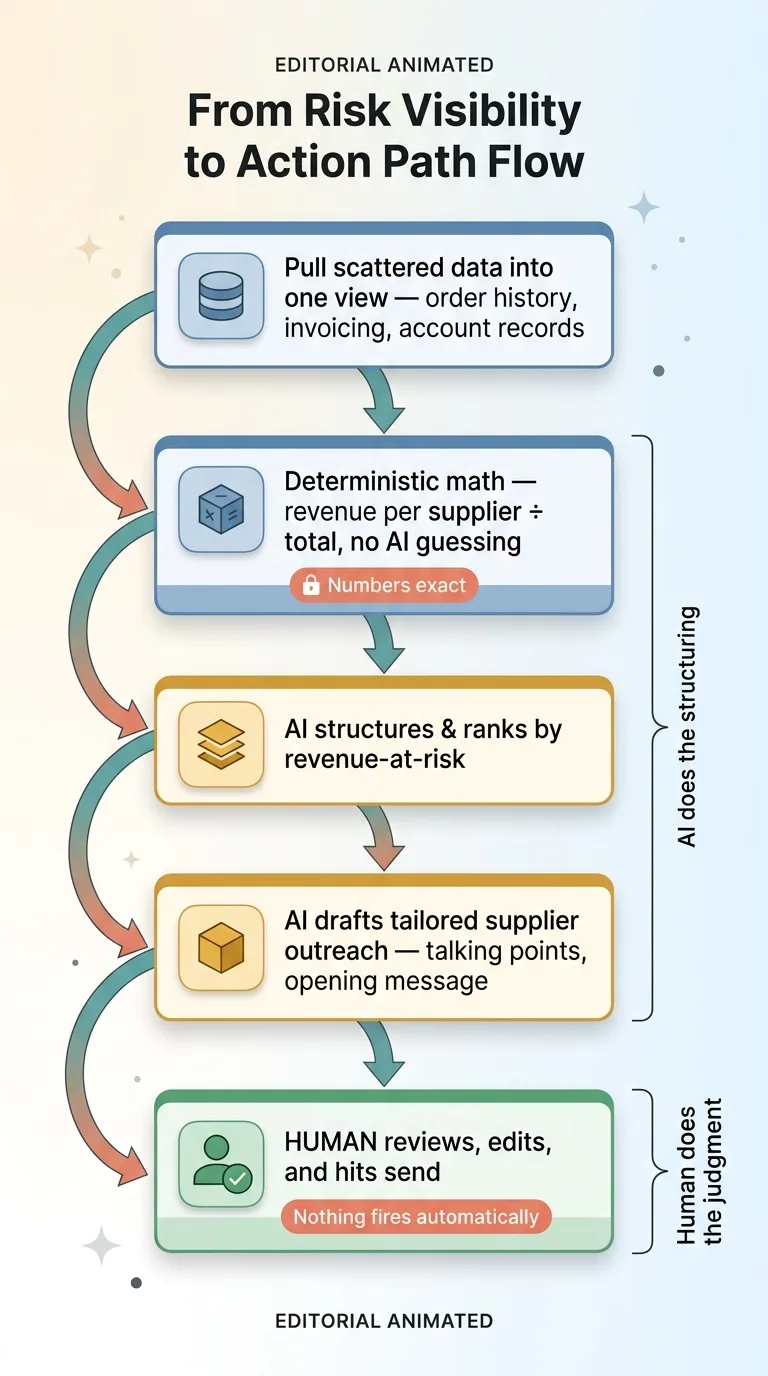
The AI's role here was structuring and surfacing, not inventing. It organized scattered product and revenue data into a clean per-supplier view and applied the rating logic consistently. It did not make up a single dollar figure. Every number traced back to actual transactions.
From Risk Visibility to an Outreach Playbook
Generated supplier-lockup outreach
A dashboard that only shows you the problem is a machine for generating anxiety. Now you know precisely how exposed you are, and you have no idea what to do about it. That's worse than not knowing.
So I paired the visibility with an action path. For each at-risk supplier, the AI generated an outreach plan to negotiate exclusivity or a contract, prioritized by revenue-at-risk. The supplier with no fallback got the most detailed plan, because that's the one to fix first.
These weren't generic templates. The AI used what we knew about each relationship, how long they'd worked together, the volume, the products involved, to draft outreach tailored to that specific supplier. Talking points, a proposed structure, an opening message.
Why the human still approves it
Nothing got sent automatically. The owner reviewed every draft, edited what didn't sound like him, and hit send himself.
 From Risk Visibility to Action Path Flow
This is non-negotiable in everything I build. Every AI action stops for a human before it touches a real relationship. A supplier negotiation is exactly the kind of thing you do not let a model fire off on its own. The cost of an awkward or wrong message to a load-bearing supplier is enormous.
The split is clean. AI does the structuring, the prioritization, and the first draft. The human does the judgment and the sending. Visibility without an action path just creates dread. Pair the scary number with the next move and it becomes a plan instead.
The Software's Real Job Is to Make You Look
Most dashboards report what's going well. Revenue up and to the right, orders flowing, a wall of green. They're comfortable to look at, which is exactly why they're nearly useless. Nobody changes behavior because a number is green.
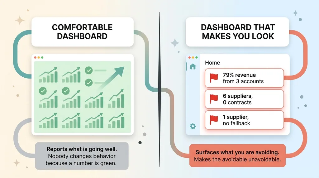 Comfortable Green Dashboards vs Dashboards That Make You Look
The valuable dashboards surface what you're avoiding. For this distributor, that meant three numbers he'd carried in his gut for years, finally on a screen and finally in dollars.
Most of his revenue from just a few accounts. Six suppliers with no contracts protecting the products that were his entire moat. One supplier with no fallback whatsoever. All of it color-coded, ranked by revenue-at-risk, sitting on the home screen where he couldn't scroll past it.
None of that was a surprise to him in the abstract. He knew all three things, vaguely, in the way you know you should get your knee looked at. The dashboard's job wasn't to tell him something new. It was to make the avoidable unavoidable, and to hand him the first move on each one.
That's the pattern across most of the systems I build. The AI isn't doing anything mystical. It's pulling scattered data into one view, doing the deterministic math, structuring the risk, and drafting the response. The hard part it solves is human: it makes you look at the thing you'd rather not.
If you've got a number you keep not looking at, a customer concentration risk dashboard, a supplier exposure you've been deferring, some figure that lives in your gut and never on a screen, that's the work I do. I build the tooling that surfaces it and tells you what to do about it. See what your scariest number actually is.
Want to explore what AI could do for your business?
Book a free 30-minute strategy call. No pitch deck, no sales team, just a real conversation about your operations and where AI actually fits.
Get AI insights for business leaders
Practical AI strategy from someone who built the systems — not just studied them. No spam, no fluff.
Hodgen.AI
Ready to automate your growth?
Book a free 30-minute strategy call with Hodgen.AI.
Book a Strategy Call