AI Creative Design Principles: Constrain Physics, Not Style
AI creative design principles that produce varied, surprising output. Constrain only what must be correct and hand the rest to the model. Here's how I built it.
By Mike Hodgen
The Mistake I Made First: A Fixed Menu of Styles
I built a creative AI tool that designs visual layouts, and my first instinct was to put it on a leash. A short one.
I gave it a fixed menu. Always-polaroid frames. Default-watercolor backgrounds. A dropdown of eight approved styles I'd hand-picked. It felt safe. It felt controllable. I was the one deciding what "good" looked like, and the model was just filling in the blanks.
The result was stiff and same-y. Every output looked like a cousin of the last one. Different subject matter, same bone structure. I'd built a machine that could only ever produce variations on what I'd already imagined.
That's the lesson that reshaped how I think about AI creative design principles: hardcoding creative options caps your output at your imagination, not the model's. You spend all this money on a system that has seen more design than you ever will, then you hand it a six-item dropdown and wonder why everything looks templated.
Here's the buyer doubt I hear constantly: "AI output is generic. It all looks the same." And you know what? Usually it does. But not because AI is generic by nature.
It's generic because someone built it to be generic.
The model didn't templatize itself. A person made a decision, on some Tuesday afternoon, to limit the range. They wrote down the styles they could think of, shipped it, and called it a feature. The blandness was designed in.
I know because I'm the person who did it. Then I tore it out and rebuilt it. What follows is what I learned about where constraints actually belong, and where they quietly strangle everything good about a generative system.
Why Hardcoded Creative Menus Always Produce Sameness
A menu is a ceiling, not a floor
When you give a model a fixed list of choices, you've converted an open-ended generator into a lookup table.
An image model can produce near-infinite visual range. It can render thousands of frame treatments, compositions, palettes, and moods you've never seen. But the moment you wrap it in a six-item style dropdown, exactly six outcomes get through. The other thousands die at the interface.
The menu isn't a starting point for the model. It's a ceiling.
In my first build I had roughly eight frame styles and five background treatments hardcoded. Do the math: that's a hard cap of 40 combinations. Forty. No matter how powerful the underlying model was, my own dropdowns guaranteed it could never produce a forty-first idea.
You're paying for range and throwing it away
This is the part that stings. You pay for these models. The pricing, the compute, the multi-model architecture, all of it buys you range. Range is the product.
Then a fixed menu throws most of it in the trash.
The deeper problem is that every hardcoded option reflects what I personally could think to write down. My eight frames were my eight frames. They came out of my head, on a specific day, under deadline. The model has seen orders of magnitude more design than I have, across more cultures, eras, and styles than I could catalog in a lifetime.
So when I limit it to my list, I'm not adding taste. I'm subtracting most of the model's capability and replacing it with my Tuesday-afternoon brainstorm.
Templated output is a self-inflicted wound. It is not a property of AI. It's a property of the architecture someone wrapped around the AI. That distinction matters because one of those things is fixable and the other isn't, and it's always the fixable one.
The Better Rule: Constrain Only the Physics
Here's the principle I now apply to every generative system I build: constrain only what must be correct, and hand creativity wholesale to the model.
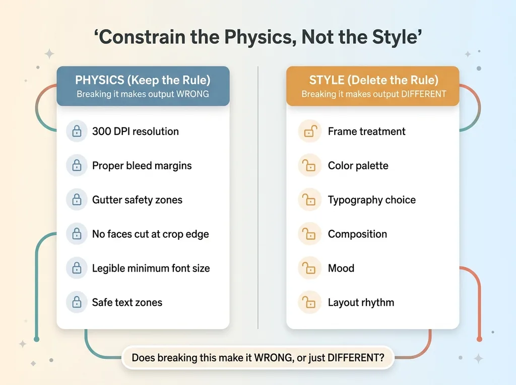 Physics vs Style: The Core Decision Test
That's it. That's the whole philosophy.
What 'physics' means in a creative system
By "physics" I mean the non-negotiable correctness rules. The laws the output has to obey to be usable at all.
In a print design system, physics looks like this: 300 DPI resolution. Proper bleed margins. Gutter safety so nothing important gets eaten by a fold. No faces cut off at the crop edge. Legible minimum font sizes. Safe text zones where words won't run off the page.
None of these are aesthetic choices. A watercolor wash versus a polaroid frame is taste. A face sliced in half at the trim line is a ruined product. Those are different categories, and most teams treat them the same.
Physics is the difference between a usable artifact and a wasted print run.
Everything else is the model's job
Frames, palettes, typography, composition, mood, layout rhythm. All of that goes to the model. All of it.
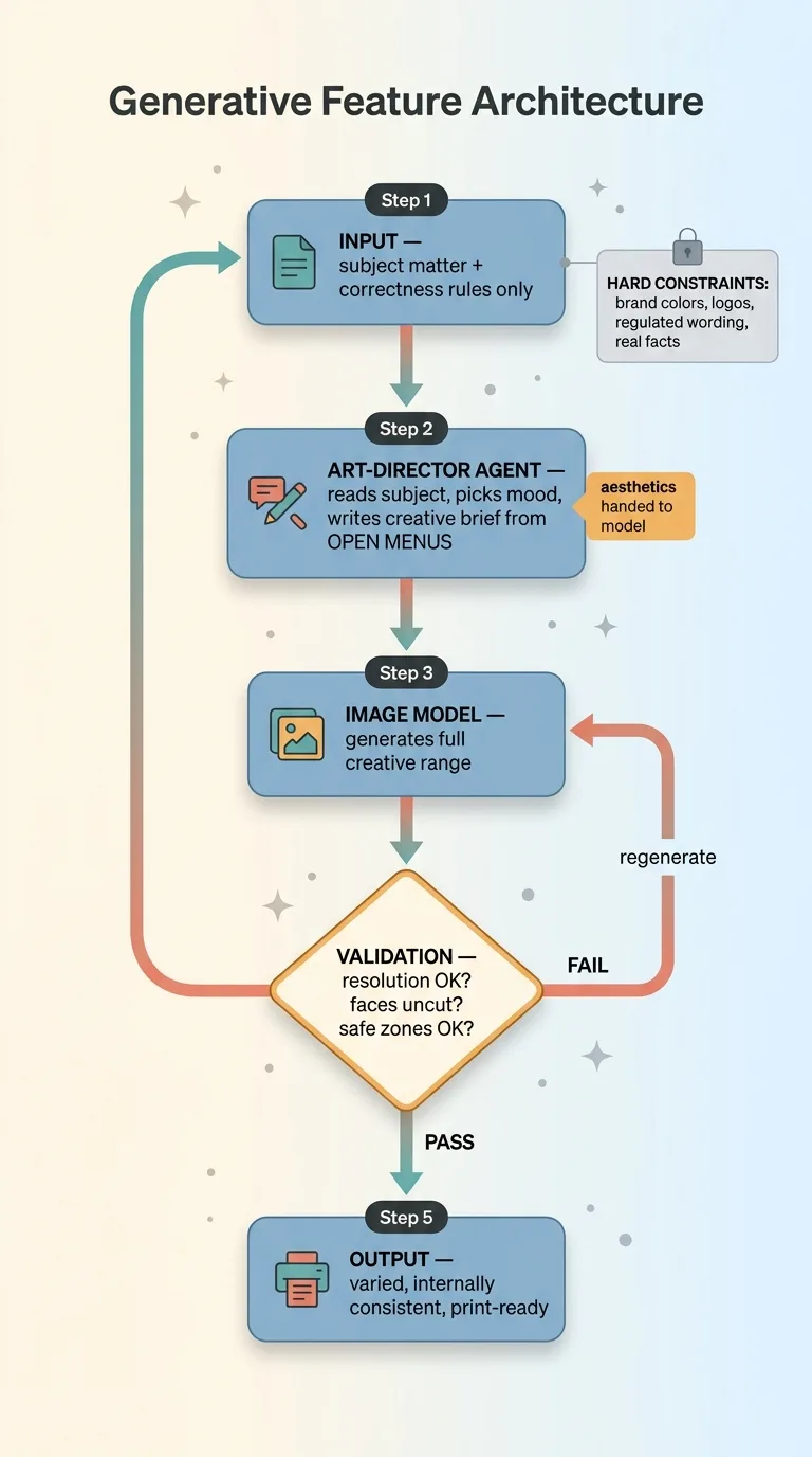 The Generative Feature Architecture Pipeline
I wrote more about this split in three ways I keep AI from embarrassing a client, but the practical test is simple enough to apply right now.
For every rule you've hardcoded, ask one question: does breaking this make the output wrong, or just different?
If breaking it makes the output wrong (a face is cut off, text is illegible, resolution is too low to print), keep the rule. That's physics.
If breaking it just makes the output different (a different frame, a bolder palette, an unexpected font pairing), delete the rule. You're not protecting quality. You're protecting your comfort, and your comfort is making everything boring.
Run that test across your whole feature. Most of what you'll find is comfort dressed up as quality control.
How I Rebuilt It: Agents That Craft Prompts, Open Menus, Infinite Range
The art-director agent
I ripped out the dropdowns and replaced them with an art-director agent.
Its job is the job a human art director does: make the aesthetic decisions and craft the prompt that drives the image model. It reads the subject matter, decides on a mood, picks a direction, and writes a detailed creative brief that goes downstream to generation.
I'm not deciding the frame anymore. The agent is. And the agent isn't limited to my list, because I never gave it one.
Open menus instead of closed dropdowns
This is the key shift. Instead of a closed dropdown that says "pick exactly one of these eight frames," the agent works from open menus.
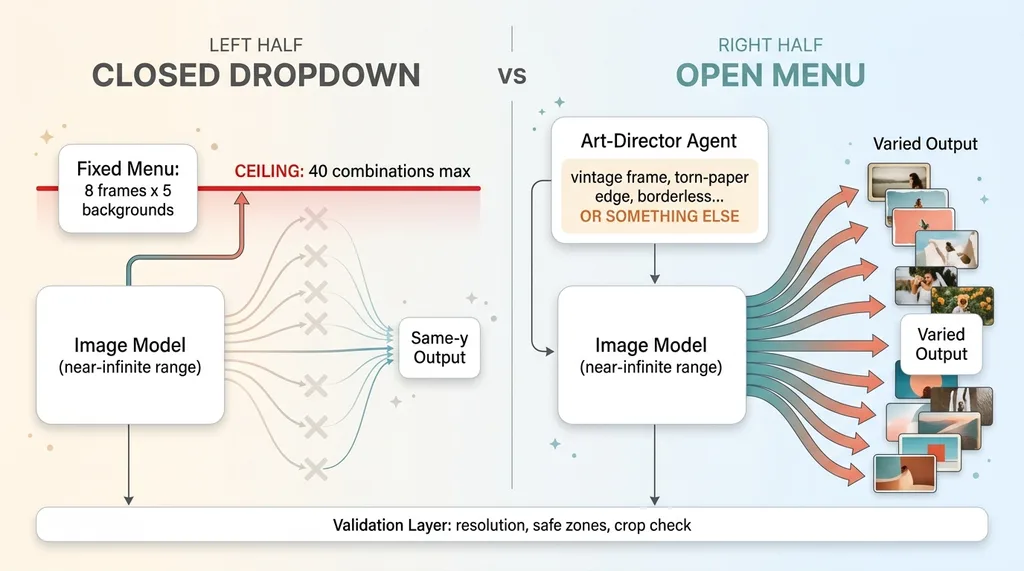 Closed Dropdown vs Open Menu Architecture
An open menu lists options as examples and suggestions, not as the complete set. The brief might say "consider a vintage frame, a torn-paper edge, a clean borderless layout, or something else that fits the subject." That "or something else" is the whole game. It tells the agent the list is a prompt for its imagination, not a cage.
The image model supplies the actual range. My code supplies only correctness.
After generation, validation kicks in. The system checks resolution. It checks that no faces got cut at the crop. It checks the safe zones. If anything violates physics, it rejects the output and regenerates. This is the same quality-control pattern I use everywhere: let the model be free, then catch the failures downstream where it's cheap to catch them.
I'll be honest about the tradeoff. This is harder to make deterministic. You cannot guarantee a specific output, and you need real validation logic or the freedom turns into chaos. That validation is exactly where the correctness constraints earn their keep.
And hard constraints still apply where they should. Where facts matter, I stop the AI from inventing things it shouldn't. Where I shouldn't generate at all (like a real product label), I composite the real thing instead. Creative freedom is not a license to fabricate facts.
What Happened When I Gave It No Style Direction
For one project I ran the experiment all the way. I gave the art-director agent no style direction whatsoever. Just the correctness rules and the subject matter: a multi-stop trip across several locations.
No frames. No palette. No mood board. Nothing.
What it produced still surprises me.
Unprompted, it invented a coherent, trip-specific aesthetic I never would have written. It chose its own frames. It picked fonts that matched the mood of the journey. And it pulled in real place names tied to the actual locations to ground the design, so the layouts felt connected to the trip instead of generic travel decoration.
Across the full set, the output was varied. Every piece looked distinct. But it was internally consistent. The whole collection clearly belonged together, the way a good design system holds together without every page looking identical.
That's exactly what a human art director delivers. Range with a through-line. Variety that still feels like one hand made it.
This was the proof of the principle in production. Given freedom and only correctness guardrails, the model produced something better than any menu I would have built. My eight frames never came close.
The surprise was the entire point. If I'd been able to predict the output, I would have just hardcoded it, and it would have been worse.
When You Should Still Hardcode (Because Some Things Must Be Correct)
I'm not telling you to remove every constraint. That's the naive version of this, and it gets people in trouble. There are real cases where you constrain hard and you don't apologize for it.
 When to Hardcode vs Liberate Decision Buckets
Brand-locked elements
Brand colors and logos often must not vary, for legal or commercial reasons. If a brand's blue is a specific hex value protected by guidelines, the model doesn't get a vote. Lock it.
Same with logos. A logo the model "reinterprets" is a logo you can't ship. These elements are correctness, not taste, because getting them wrong creates an actual problem, not just a different look.
Anything tied to a real fact
Product photography that must show the actual product. You can't let the model invent your label or guess at your packaging. That's where you composite the real thing instead of generating a plausible fake.
Regulated content where the wording is fixed by law. Pricing, claims, disclaimers, anything with a compliance dimension. Those get hardcoded and validated, full stop.
And anything tied to a verifiable fact. If reality has an answer, the model doesn't get to make one up.
The principle was never "never constrain." It's constrain correctness, liberate taste.
So here's your decision test. List out every rule you've hardcoded into your generative feature. For each one, ask: does this protect correctness, or does it just protect my comfort?
Keep the correctness rules. Delete the comfort rules. That single audit usually doubles the range of what a system can produce.
How to Architect This Into Your Own Generative Feature
This isn't a print-design thing. It applies to any generative feature you ship: AI-generated ad creative, email layouts, product imagery, social posts, slide decks, anything.
 Five-Step Framework to Architect This
Here's the framework, plainly:
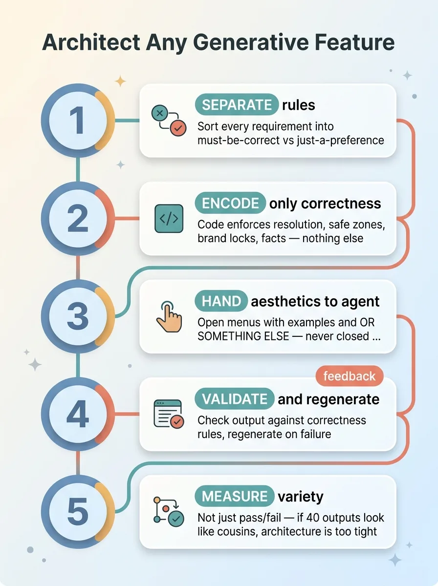
1. Separate correctness rules from aesthetic rules. Before you write any code, sort every requirement into two buckets: must-be-correct and just-a-preference. Most teams never make this distinction, which is why their features feel like spreadsheets that draw pictures.
2. Encode only correctness in code. Resolution, safe zones, brand locks, regulated wording, factual accuracy. That's what your code enforces. Nothing else.
3. Hand aesthetics to an art-director agent working from open menus. Give it examples and suggestions, never closed dropdowns. Let "or something else that fits" be a real instruction.
4. Validate output against correctness rules and regenerate on failure. This is non-negotiable. Freedom without validation is just chaos. The validation layer is what lets you be bold upstream.
5. Measure variety, not just pass/fail. Most teams only check whether output is valid. Also check whether it's varied. If forty outputs look like cousins, your architecture is still too tight, even if everything technically passes.
The reassurance I want you to walk away with is this: AI output is generic because of how it was built, not because of what it is. If your AI features look templated, that's an architecture problem. And architecture problems are fixable.
This is the kind of decision I make on every system I build. Where to constrain, where to let go, and how to tell the difference under deadline. It's the line between a feature that impresses people and one that quietly bores them.
Want to explore what AI could do for your business?
Book a free 30-minute strategy call. No pitch deck, no sales team, just a real conversation about your operations and where AI actually fits. If your generative features feel templated, I can usually spot why in the first ten minutes.
Get AI insights for business leaders
Practical AI strategy from someone who built the systems — not just studied them. No spam, no fluff.
Hodgen.AI
Ready to automate your growth?
Book a free 30-minute strategy call with Hodgen.AI.
Book a Strategy Call