How I Built a Unified Analytics Dashboard for a Wealth Management Firm
I built a unified analytics dashboard connecting GA4, GSC, and Google Ads for a wealth management client. Here's the architecture and what it revealed.
By Mike Hodgen
A financial advisory firm I was working with had five browser tabs open at all times. GA4 in one. Google Search Console in another. Google Ads in a third. Gmail and a task board rounding out the set. Five data sources, none of them talking to each other.
The CEO couldn't answer basic questions. Which blog posts are actually driving consultation requests? Which Google Ads keywords lead to clients who stay longer than a year? Is the SEO investment paying off or just generating vanity traffic that never picks up the phone?
Building a unified analytics dashboard for this firm became one of the most valuable projects I've done — not because the technology was complex, but because the answers it surfaced changed how they spent every marketing dollar.
The Data Fragmentation Problem No One Talks About in Service Businesses
Three Tools, Three Truths, Zero Clarity
Here's what the CEO's daily reality looked like. GA4 said traffic was up 22% quarter over quarter. Great. GSC showed impressions climbing on key financial planning queries. Also great. Google Ads reported a cost-per-click of $4.80, well below industry average. Wonderful.
So why weren't consultations increasing?
Because none of these tools could answer the question that actually mattered: which marketing activity is creating clients? Not clicks. Not impressions. Not sessions. Clients.
Each tool told its own truth in isolation. GA4 said people were visiting. GSC said people were finding them. Google Ads said the spending was efficient. But the gap between "efficient clicks" and "signed clients" was a black hole.
Why Service Businesses Get Hit Hardest
I've centralized analytics from 7 data sources for my own DTC fashion brand. That was complex, but ecommerce has a structural advantage: the conversion event happens inside the digital ecosystem. Cart to purchase. One tool can track it.
Wealth management — and most service businesses — don't work that way. A prospect might read four blog posts over six weeks, click one ad, then call the office to schedule a meeting. The conversion event (a phone call, an email, a booked consultation) often happens outside the tools tracking digital behavior.
This means the standard analytics stack is structurally blind to what matters most. You can see the top of the funnel clearly. You can see the bottom of the funnel clearly. The middle — where the actual decision happens — is dark.
This client needed something different from what I'd built for my brand. Fewer data sources, but deeper correlation across a much longer sales cycle.
What the Unified Dashboard Actually Connects
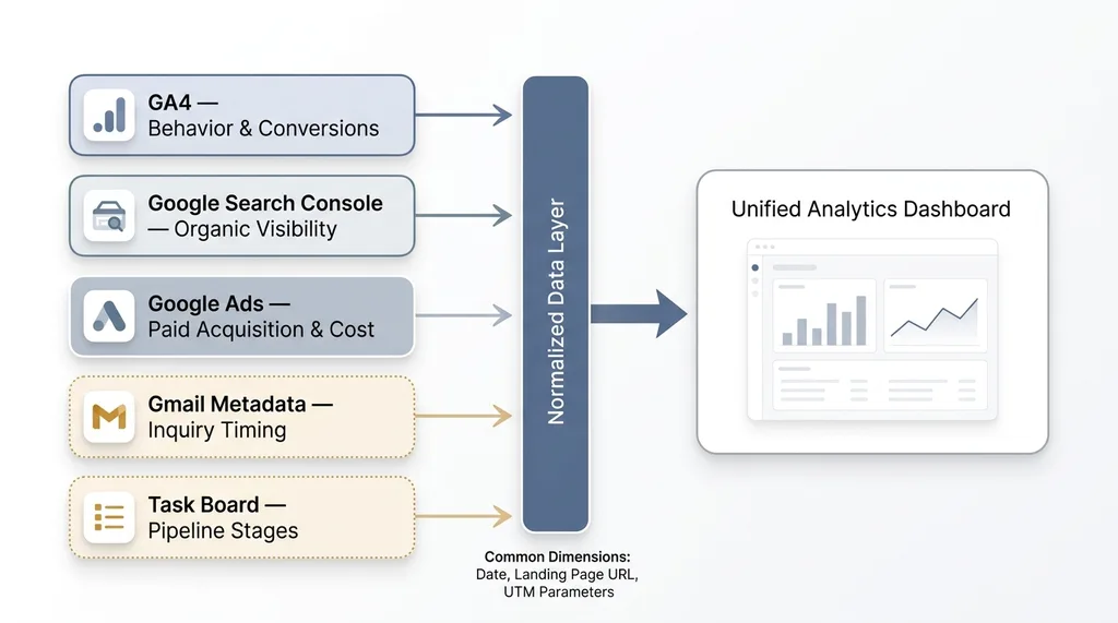 Five Data Sources Converging into One Dashboard
GA4: Behavior and Conversion Events
First problem: the firm had GA4 installed but zero custom events configured. Just default page_view tracking. That's like having a security camera system but never turning it on.
We set up custom conversion events for the actions that actually indicate intent: consultation form submissions, phone number click events, PDF downloads of their retirement planning guides, and scroll depth on key service pages. Without these, GA4 is just counting warm bodies.
Once the events were in place, we pulled session data, page engagement metrics, and conversion paths through the GA4 Data API.
Google Search Console: Organic Visibility and Content Performance
GSC gives you the other half of the organic story. Impressions, clicks, average position, and CTR by query and by page.
This is where you discover two distinct problems. Content getting eyeballs but not clicks means you have a title and meta description problem — people see you in search results and keep scrolling. Content that converts well but nobody finds means you have a distribution problem — the content works, you just need more people to see it.
Both problems have solutions. But you can't find either one if GSC data lives in its own tab, disconnected from what happens after the click.
Google Ads: Paid Acquisition and Cost Data
We pulled campaign spend, CPC, conversion data, and search term reports from the Ads API. Standard stuff.
The non-standard part was mapping ad click paths into GA4 behavior data. Which ad groups led to multi-page sessions where prospects explored the site? Which ones led to immediate bounces? A $4.80 CPC looks great until you realize the visitor left in 8 seconds.
Gmail and Task Board: The Missing Link
This was the unusual piece, and the one that made the whole dashboard work.
The firm's intake process started with email. We synced email metadata — not content, just sender domains, timestamps, and subject line patterns — to correlate new inquiry volume with marketing activity. When did people reach out? How long before they got a response? Did inquiry spikes follow content publication or ad campaigns?
The task board integration tracked prospect stage movement. Someone goes from "inquiry" to "consultation scheduled" to "proposal sent" to "client signed." We pulled that progression data to connect top-of-funnel marketing metrics to actual pipeline outcomes.
No single tool gives you this picture. GA4 tells you someone visited. GSC tells you how they found you. Google Ads tells you what you paid. Gmail tells you they reached out. The task board tells you if they became a client.
The Architecture: How I Connected Everything Without a $50K BI Platform
API Layer and Data Pipeline
The pipeline is Python-based. Scripts pull from the GA4 Data API, GSC API, and Google Ads API on a daily schedule. Gmail metadata and task board data sync on shorter intervals since response time turned out to matter (more on that below).
Everything lands in a structured database with normalized schemas. The normalization is what makes cross-source queries possible. When GA4 session data and GSC query data and Ads click data all share common dimensions — date, landing page URL, UTM parameters — you can join across them and ask questions no single tool can answer.
Why I Didn't Use Looker Studio
People ask this. Looker Studio is fine for single-source visualization. It's terrible at cross-source correlation.
Try asking Looker Studio: "Show me blog posts ranked in positions 1-5 in GSC that also have high GA4 engagement but low conversion rates." You'll spend hours building painful workarounds with blended data sources that break every time Google updates something.
The custom dashboard is a Next.js interface. It cost more upfront. It pays for itself every week in the questions it can answer without anyone needing to know SQL or wrestle with Looker's blending limitations.
Total build time: about a weekend for the core pipeline, another day for the dashboard UI. The real work was the ongoing iteration during the first month as we discovered which views actually mattered for this firm's specific decision-making.
One important note for the wealth management vertical: compliance matters. We store no PII in the analytics layer. Email metadata means timestamps and domains, never content. The dashboard tracks patterns, not people.
Three Insights the Dashboard Revealed in the First Week
This is where it gets concrete.
The $3,200/Month Ad Campaign Driving Zero Consultations
A Google Ads campaign targeting broad financial planning keywords was spending $3,200 per month. GA4 showed that traffic from those keywords bounced at 78%. Not ideal, but the client had assumed some percentage would convert.
When we cross-referenced with the task board pipeline, the answer was worse than "some." It was zero. Not one consultation in the pipeline traced back to those broad keywords. The client had been running this campaign for 11 months. That's roughly $35,000 spent on nothing.
We reallocated the budget to long-tail keywords that matched the topics already converting through organic search. Within six weeks, the same spend was generating 3-4 consultations per month.
The Blog Post Generating 40% of Qualified Leads
One blog post about retirement planning for business owners — a piece the client almost didn't publish because they thought the topic was "too niche" — turned out to be the entry point for 40% of prospects who eventually booked consultations.
GSC showed it ranking position 3 for a valuable query with strong commercial intent. GA4 showed high time-on-page and a consistent navigation pattern: readers went from the blog post to the "About" page to the "Contact" page. That's a buying pattern.
This insight changed the entire content strategy. Instead of writing broad financial literacy content, we doubled down on similar business-owner-specific topics. I built a content machine for a financial advisory firm around exactly this kind of data-driven content strategy — letting the analytics tell you what to write next instead of guessing.
The Email Response Time Problem
This one wasn't a marketing insight. It was an operations insight that only surfaced because we connected email data to outcome data.
Gmail metadata showed that prospects who emailed on weekends waited an average of 41 hours for a response. Prospects who emailed Monday through Thursday waited 4 hours.
The weekend inquiry-to-consultation conversion rate was 12%. Weekday conversion was 34%.
Same marketing. Same content. Same types of prospects. The only difference was how long they waited for someone to respond. By the time Monday morning rolled around, weekend emailers had already called another firm.
The fix was simple — a weekend email monitoring rotation that cost the firm maybe two hours of admin time per week. That single operational change recovered an estimated 6-8 consultations per quarter that were previously evaporating.
No Google Ads report would have shown this. No GA4 dashboard would have flagged it. It only became visible when email response patterns and pipeline conversion data lived in the same system.
What Most Analytics Setups Get Wrong
Dashboards That Report Instead of Correlate
Most businesses have dashboards that show metrics in isolation. Sessions this month. Impressions this quarter. Ad spend this week. Traffic by channel. That's reporting. It's not analytics.
The value is in correlation. Connecting a GSC ranking improvement to a GA4 behavior change to a pipeline outcome. Seeing that a position jump from 8 to 3 on a specific query led to a traffic increase that led to more form submissions that led to signed clients. That's a story you can act on. An isolated number is just a number.
The Vanity Metrics Trap for Service Businesses
Service businesses are especially vulnerable here. A law firm might celebrate 10,000 monthly visitors without realizing 9,200 of them are reading one blog post about a topic that never generates clients. A wealth management firm might celebrate low CPC without tracking whether those clicks ever become consultations.
The unified analytics dashboard forces honest questions. Not "how much traffic did we get?" but "which traffic led to revenue?"
I'll be honest about the limitations: attribution in service businesses is inherently messy. A client might discover the firm through organic search, read content for weeks, then get referred by a friend at a dinner party and call directly. The dashboard catches digital touchpoints but can't capture the dinner party conversation.
We address this gap with intake questionnaires — "how did you hear about us?" — and feed that data back into the system. It's imperfect. It's still better than the alternative, which is guessing.
Building This for Your Firm: What It Takes
Prerequisites You Need in Place
Before any dashboard work, you need:
- GA4 with custom events configured. Not just default page_view tracking. You need events for form submissions, phone clicks, PDF downloads — whatever constitutes a meaningful action in your business. If you don't have these, step one is setting them up. The dashboard is only as good as the data feeding it.
- Google Search Console verified and accumulating data. GSC needs a few months of history to show useful patterns.
- Google Ads with conversion tracking. If you're running ads without conversion tracking, you're flying blind regardless.
- Some system of record for your client pipeline. A CRM, a task board, even a well-structured spreadsheet. You need a way to track prospect progression from inquiry to signed client.
Timeline and Ongoing Maintenance
Core build is 1-2 weeks. The first month after that is iteration — discovering which correlations matter for your specific business. The retirement planning blog post insight? That didn't come from a pre-planned dashboard view. It emerged from exploring the data and noticing a pattern.
Ongoing maintenance is minimal. Mostly updating when Google changes their APIs, which they do with irritating frequency. The GA4 Data API has been relatively stable, but the Ads API likes to deprecate fields with minimal warning.
When a Unified Dashboard Isn't Worth It
Honesty matters here. If you're spending less than $1,000 per month on marketing, the data volume is probably too low for meaningful correlation. If you have fewer than 50 monthly conversions, statistical noise will swamp any signal. You'll see patterns that aren't really there.
For firms spending $5K or more monthly on marketing with a decent content library and active Google Ads, the ROI is almost immediate. Just finding the one wasted campaign — like that $3,200/month money pit — usually pays for the entire build.
This Is What a Chief AI Officer Actually Builds
The dashboard itself is useful. But the real value is the thinking behind it: identifying which data needs to connect, building the pipeline to make it happen, and then — critically — interpreting what the data says and turning it into operational changes.
That's what a Chief AI Officer actually does. Not installing AI tools. Not building chatbots. Connecting systems so the business makes better decisions with the information it already has but can't currently see.
If you're running a service business and suspect your marketing data is lying to you by omission — showing you pieces of the truth but never the whole picture — I'd be happy to walk through what this looks like for your firm.
Thinking About AI for Your Business?
If any of this resonated, let's talk. I do free 30-minute discovery calls where we look at your operations and figure out where AI and data integration could actually make a measurable difference — not theoretically, but based on what I've seen work.
Get AI insights for business leaders
Practical AI strategy from someone who built the systems — not just studied them. No spam, no fluff.
Ready to automate your growth?
Book a free 30-minute strategy call with Hodgen.AI.
Book a Strategy Call