Client-Safe Website Editing With AI: Scoped Control
Client-safe website editing AI lets owners update the homepage without breaking SEO. Here's how I scoped control so they get the fun part, not the risk.
By Mike Hodgen
The salon owner who wanted to run her own promos
A salon owner I worked with had a simple, reasonable request. She wanted to swap her homepage banner whenever she had a promo to run. A holiday special in December. A Mother's Day push in May. A slow-Tuesday discount to fill chairs that would otherwise sit empty.
She didn't want to text me every time and wait a day for it to go live. Fair enough. By the time I'd made the change, half her promo window was gone.
Here's the thing about her business, and most local service businesses: the fast money is in seasonal, time-sensitive offers. A Mother's Day banner that goes up on May 8th is worth a fraction of one that goes up on May 1st. Speed is the whole game.
So she wanted control. And I understood exactly why.
The problem is that the only way to give her that control with a normal CMS is full admin access. And full admin access is the exact door through which sites get broken. Not maliciously. Just by someone who doesn't know that the H1 tag and the banner headline are two different things, and that touching the wrong one quietly tanks the page.
This is the tension at the heart of client-safe website editing AI: owners want control, and owners shouldn't have all of it. Both are true at once.
It's a mid-funnel decision a lot of business owners hit the moment they want to move faster than their developer. You feel the friction, you ask for the keys, and your developer goes quiet because they know what happens next.
The answer isn't "give her access" or "don't." It's deciding, on purpose, exactly which keys she gets.
Why full CMS access is how sites get broken
When you hand someone full CMS access, the damage comes in two flavors. One you can see. One you can't. The invisible one is the killer.
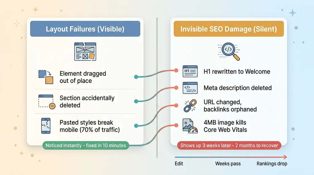 Two flavors of CMS damage: visible layout failures vs invisible SEO damage
The layout failures
These are the obvious ones. The owner drags an element three pixels and the whole row reflows. They delete a section because they thought they were deleting one image. They paste a paragraph from a Google Doc and it drags in inline styles that look fine on desktop and completely wreck the layout on mobile, where 70% of their traffic actually is.
Annoying. Visible. But fixable in ten minutes once someone notices.
The owner usually notices these themselves because the page looks wrong. That's the saving grace of layout failures: they announce themselves.
The invisible SEO damage
This is the dangerous category, because nothing announces itself.
The owner rewrites the H1 to say "Welcome!" and now the page that used to rank for "balayage San Diego" targets nothing. They delete the meta description because they didn't know it was doing anything. They change a URL to make it "cleaner" and orphan every backlink pointing at the old one. They swap a hero image with no alt text, or worse, upload a 4MB photo straight off their phone that drags Core Web Vitals into the red.
The owner never sees any of it. The page still looks fine. It loads. The banner reads correctly. By every signal they can perceive, nothing is wrong.
Then three weeks later, rankings slide. Traffic dips. Nobody connects it to the edit because the edit was a month ago and "all I did was change the picture."
I've watched a single bad SEO change cascade across a site. One H1 rewrite, one orphaned URL, and you spend two months rebuilding what took one click to break. The recovery cost is wildly out of proportion to the size of the mistake.
This is the buyer doubt made concrete. Control feels safe until it isn't, and the moment it isn't, you can't even tell which edit caused the problem.
Scoped control is a design decision, not a CMS setting
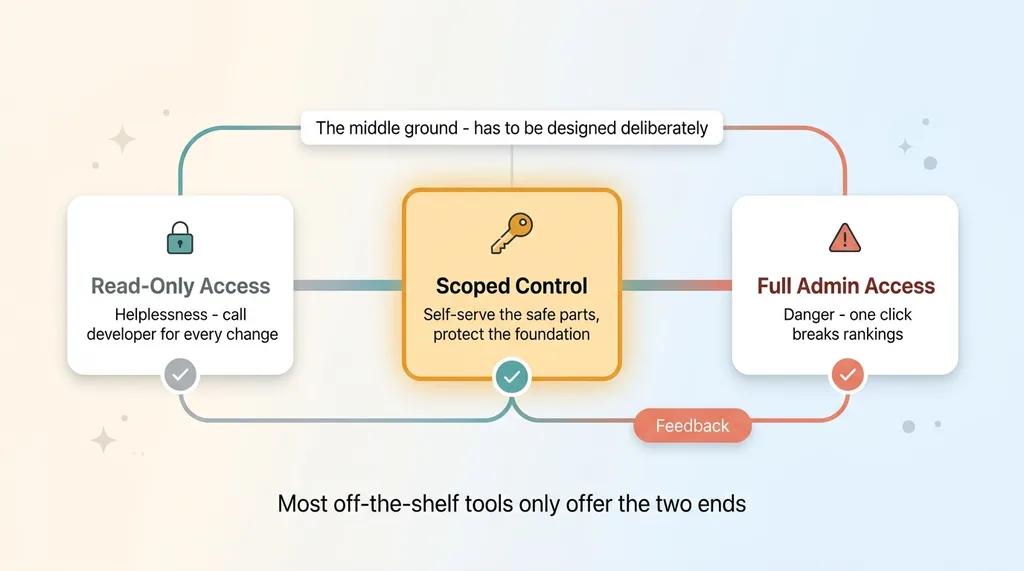
Most people think the choice here is binary. Lock the owner out, and she calls the developer for every change. Or give her everything, and she breaks the site. Pick your poison.
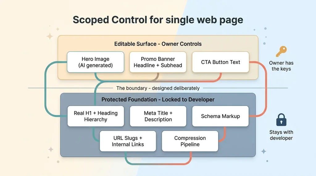 Scoped control: the editable surface layer vs the protected SEO foundation
That's the wrong frame entirely.
The right amount of control isn't a toggle you flip in your CMS settings. It's something you design deliberately, element by element, based on which parts of the page actually carry risk.
Walk any page and you'll see it splits cleanly. The hero image is low-risk, high-value, and honestly kind of fun to change. The promo copy is the same. These are the parts the owner wants to touch and the parts that recover instantly if she gets them wrong.
Then there's the other half. The H1. The URL structure. The schema markup. The meta tags. The internal linking. The page layout. These are high-risk and low-reward for the owner to touch. She gains nothing by editing them and risks everything.
So you split them.
The owner gets a control surface that exposes only the safe levers. Everything structural is invisible to her and stays with me. She doesn't see the schema markup because she has no reason to, and every reason to break it by accident.
This is what scoped CMS access design actually means. Not "read-only versus admin." A custom-built boundary where the editable surface and the protected foundation are two separate things that happen to live on the same page. The owner operates the top layer. The foundation never moves.
The skill here isn't the technical implementation. It's the decision about where the line goes.
What the owner actually got to control
Here's what the salon owner's editing screen actually looked like. Not a CMS. Three boxes and a generate button.
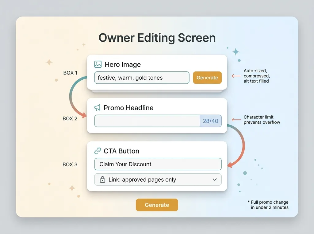 The owner's actual editing screen: three boxes and a generate button
AI hero image generation
She doesn't upload images. She describes a vibe.
She types "festive, warm, gold tones" or "bright summer, fresh" and AI generates options on the spot. The key part is what happens around the generation. Each image comes out already sized for the hero slot, already compressed to a sane file weight, with alt text auto-filled from a template tied to her business.
She physically cannot upload a 4MB photo, because she isn't uploading anything. The AI hero image generation for business sites is the only path, and that path has the technical constraints baked in.
This is the same approach where one AI image call replaced a whole compositing stack. She gets a polished, correctly-formatted hero in fifteen seconds, and the Core Web Vitals score she's never heard of stays exactly where I left it.
Promo copy with limits
She edits the banner headline and subhead in a constrained field. There's a character limit, so the text physically cannot overflow the layout and break on mobile. If she tries to write a novel, the field stops her at the length that fits.
And critically, that field is the promo banner only. It is not the SEO H1. The H1 underneath the banner stays mine, optimized for the keyword the page actually ranks for. She changes the visible marketing message. The search engine sees the same structural heading it always has.
The CTA button text is editable too. The link target is locked to a list of approved pages, so she can change "Book Now" to "Claim Your Discount" but she can't accidentally point the button at a dead URL.
The whole interface looks like three boxes and a generate button. It looks nothing like a CMS, on purpose. That's the same philosophy behind building an AI command center for someone who'd never used AI. The complexity stays behind the glass. The owner sees only the levers she's supposed to pull.
She runs a full promo change in under two minutes. No code, no ticket, no waiting on me.
What stayed locked to me, and why
Everything structural stayed with me. Here's the list, with the one-line reason each one is locked.
Page structure and section order. Locked. Reorder a section and you change how the whole page reads to both humans and crawlers. She has no reason to touch it.
The real H1 and heading hierarchy. Locked. This is the single most important on-page ranking signal. The banner headline she edits sits on top of it visually, but the H1 underneath never moves.
Meta title and description. Locked. These control how the page shows up in search results. Delete the meta description and you hand Google a blank to fill however it wants.
Schema markup. Locked. The LocalBusiness data, services, hours, reviews. This is what powers her rich results in search. It's fragile, invisible, and catastrophic to break.
URL slugs and internal links. Locked. Change a slug and you orphan every backlink and internal link pointing at it. This is the kind of mistake that's nearly impossible to even diagnose later.
Image alt text logic and compression pipeline. Locked. This runs automatically behind the hero generator. She benefits from it without ever seeing it.
The pattern is consistent. Everything locked is something that moves rankings, that the owner has no reason to touch, and every chance of breaking. The promo banner sits visually on top of all this fixed structure. She changes the message everyone sees while the SEO foundation never shifts an inch.
And nothing she does auto-publishes a structural change. There's no path from her editing screen to the schema or the H1. The system is built so that every AI action stops for a human before anything structural goes live. The whole boundary holds because of guardrails that keep owner edits from breaking the site, not because I trust everyone to be careful.
This is the direct answer to the buyer's doubt. She gets real control. She carries none of the risk.
How to decide where to draw the line
You can apply this to any business, not just a salon. Here's the test.
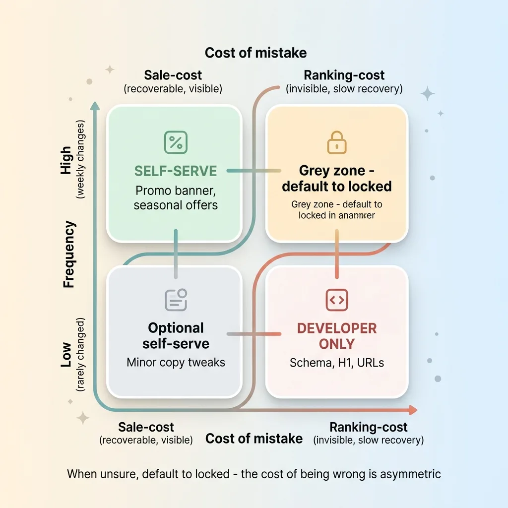 Decision matrix: sale-cost vs ranking-cost crossed with frequency
For any element on the page, ask one question: if the owner changes this badly, does it cost a sale or cost a ranking?
A sale-cost mistake is recoverable. Wrong promo, ugly banner, typo in the headline. The owner notices it immediately because it's right there on screen, and it's fixed in two minutes. These are safe to delegate. The downside is small, visible, and instant.
A ranking-cost mistake is the opposite. Broken H1, deleted meta, changed URL, missing schema. It's invisible, the damage shows up weeks later, and recovery is slow and expensive. These stay with the developer. Always.
That's the first axis. Here's the second: frequency.
Things that change weekly, like promos and seasonal banners, should be self-serve. The whole point is speed, and routing weekly changes through a developer is friction that costs real money. Things that change rarely, like page structure and schema, shouldn't have a self-serve button at all. There's no speed benefit to delegating something touched twice a year, and every risk.
Put those two axes together and most decisions answer themselves.
High frequency, sale-cost: self-serve. That's the promo banner.
Low frequency, ranking-cost: developer only. That's the schema and the H1.
The grey zone is small once you map it this way. Most elements fall cleanly into "let them do it" or "they should never see this button." When you're unsure, default to locked, because the cost of being wrong is asymmetric. An over-locked site is annoying. An over-exposed site loses you rankings you can't easily get back.
This is how you let clients edit site without breaking SEO. Not by hoping they're careful. By deciding, element by element, what they can reach.
The right amount of autonomy is something you build on purpose
The salon owner runs her own seasonal promos now. Mother's Day, slow Tuesdays, holiday specials. Two minutes each, no ticket, no waiting on me.
 The off-the-shelf binary trap vs the designed middle ground
And she hasn't broken her rankings once. Not because she got careful. Because the parts that could break were never handed to her in the first place.
This is the same principle behind every system I ship. Scoped autonomy beats all-or-nothing access, every time. The skill isn't building a CMS. Anyone can do that. The skill is deciding what to expose and what to protect, then building the boundary so the line holds even when someone's moving fast and not paying attention.
Most off-the-shelf website tools don't offer this middle ground. They give you read-only or admin, helplessness or danger, and nothing in between. So owners get stuck choosing between calling their developer for every banner change or risking the whole site every time they want to run a promo.
The middle ground exists. It just has to be designed.
If you want your team or your clients to self-serve the fast-moving parts of their site while the foundation stays protected, that boundary is a thing someone has to build deliberately. That's the kind of work I do.
Want to explore what AI could do for your business?
Book a free 30-minute strategy call. No pitch deck, no sales team, just a real conversation about your operations and where AI actually fits.
Get AI insights for business leaders
Practical AI strategy from someone who built the systems — not just studied them. No spam, no fluff.
Hodgen.AI
Ready to automate your growth?
Book a free 30-minute strategy call with Hodgen.AI.
Book a Strategy Call