AI Images for Print: Surviving a Real Printer
AI images for print look great on screen and fall apart on paper. Here's the exact prepress pipeline to get 300 DPI, gamut-correct, print-ready files.
By Mike Hodgen
Why AI Images Look Great on Screen and Die in Print
I'm building a physical product right now from AI imagery. Printed pages, real paper, the whole thing. And the first time I sent a render to a real printer, I learned exactly how big the gap is between ai images for print and ai images that just look nice on a monitor.
The render was gorgeous. Vivid sky, deep colors, sharp detail. I sent it off feeling good. Then the proof came back and it was wrong in three separate ways.
First, the image was soft. Pixelated right at the trim edge, like someone smeared Vaseline on the corners. Second, the sky had visible stair-stepping, hard bands where there should have been a smooth fade. Third, the colors I picked because they popped on screen came back as mud. The electric blue went gray-blue. The punchy magenta turned into a sad pink.
None of this was the model's fault. A screen has a backlight and a wide color gamut. Paper has neither. A monitor emits light; paper reflects it. The gap between "looks good in Photoshop" and "sells as a physical artifact someone paid for" is a pile of unglamorous prepress work that nobody talks about because it isn't fun.
Taking generated images to production always surfaces problems nobody warns you about (production image pipelines have other surprises too). Print is one of the worst offenders.
So here's the actual pipeline I run. Not theory. The exact sequence I use to turn a generated image into something I can print, sell, and not get returned. Resolution, metadata, color, gradients, text, proofing. In order.
Resolution: Why You Generate at 4K, Not the Final Trim Size
The DPI math nobody does upfront
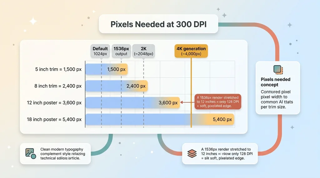
Print needs 300 DPI. That's the standard, and it's not negotiable for anything you want to look sharp in someone's hands.
 DPI math, pixels needed per trim size
Here's the math people skip. At 300 DPI, every inch of printed image needs 300 pixels. So a full-bleed page that's 8 inches on the long edge needs 2,400 pixels. Twelve inches needs 3,600 pixels. An 18-inch poster edge needs 5,400 pixels.
Now look at what most generation defaults give you. 1024. 1536. Even a "2K" output is around 2,048 pixels. None of those cover a large trim at 300 DPI without falling short. Your 1536-pixel render covers about 5 inches at full quality. Stretch it across 12 inches and you're effectively printing at 128 DPI. That's the soft, pixelated edge I got on my first proof.
Generate at the highest tier, then place
I generate every full-bleed page at 4K. Roughly 4,000 pixels on the long edge. It's the only tier that covers large trims at 300 DPI without me having to invent pixels later.
And inventing pixels is exactly what naive upscaling does. Run a 1536 render through an upscaler to "hit" 4K and the algorithm guesses at detail that was never there. It looks fine zoomed out on a screen. Printed at trim size, it reads as soft and faintly plasticky, because the detail is hallucinated, not captured.
So the rule for ai image print resolution is simple: generate large, then place into your layout at the physical size you need. Don't generate small and stretch. The cost difference between a 1536 generation and a 4K one is a few cents. The cost of reprinting a run is not.
The Missing DPI Tag (And Why Your Printer Thinks Your File Is Tiny)
Here's the one that cost me an afternoon of confusion.
 Same pixels, different DPI tag = different print size
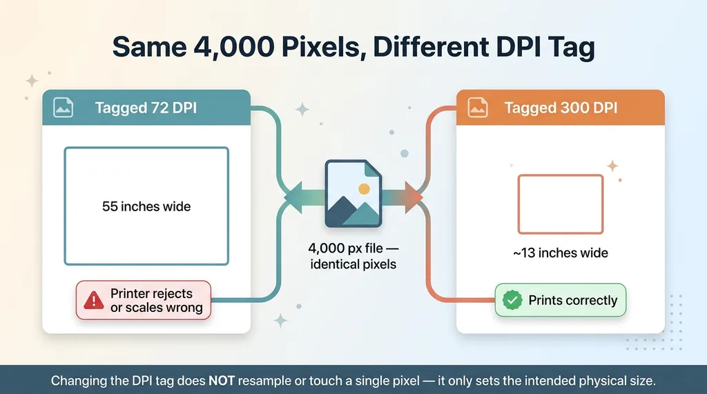
Generated images carry no correct DPI metadata. They ship tagged as 72 DPI, or with no resolution tag at all. The pixels are completely fine. You can have a perfect 4,000-pixel image. But the metadata lies about how big those pixels are meant to be physically.
A print backend reads that tag to decide the intended physical size. If your 4,000-pixel file says "72 DPI," the backend thinks you want to print it at 55 inches wide. It'll either reject the file as too low resolution for that size, scale it to something wrong, or print at a physical size you never intended.
The fix is a single explicit pipeline step: re-tag the DPI metadata to 300 after generation. I do this automatically on every print-bound image in my toolkit.
Here's the part that trips everyone up. Changing the DPI tag does not change the pixel count. It does not resample the image. It does not touch a single pixel. It only tells the printer the intended physical size of the pixels you already have.
A 4,000-pixel image tagged at 300 DPI prints at about 13 inches. The same 4,000 pixels tagged at 72 DPI prints at 55 inches. Same pixels, different instructions. It's a one-line fix that people skip entirely because they don't know the tag exists or what it does.
sRGB vs CMYK: Stop Hand-Converting Your AI Art
Why naive CMYK conversion turns neon into mud
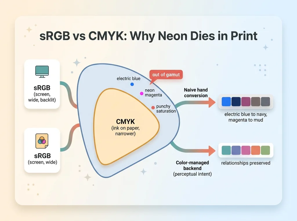
Every generated image comes out in sRGB. That's the screen color space, wide and bright and backlit.
 sRGB vs CMYK gamut and why naive conversion dulls color
The instinct, because everyone "knows" print is CMYK, is to convert to CMYK yourself before sending the file off. Don't. This is where my saturated colors collapsed.
CMYK has a smaller gamut than sRGB. Neon, electric, and highly saturated tones live outside what CMYK can physically reproduce with ink on paper. When you run a naive conversion, those out-of-gamut colors get clamped to the nearest dull equivalent the math can find. Your electric blue becomes a flat navy. Your magenta becomes mud. The conversion isn't broken; the color was always going to lose energy moving to paper. A bad conversion just makes the loss worse and unmanaged.
Ship sRGB to the right print backend
My approach for srgb cmyk ai art: keep the file in sRGB and send it to a print backend that does its own color-managed conversion.
A real print backend converts using profiles built for its specific paper and ink, with proper rendering intents that decide intelligently how to handle out-of-gamut colors. Perceptual intent, for instance, shifts the whole image gently to preserve the relationships between colors instead of brutally clamping the bright ones. The backend's conversion is engineered for its exact hardware. Mine, guessing in Photoshop, is not.
If you want to preview the damage before committing, soft-proof. Most layout tools let you load the print profile and simulate on screen how the colors will desaturate. It's the honest preview. You'll see the neon die before you pay for the proof, and you can adjust your palette toward colors that survive.
But the conversion itself? Let the people who built the printer handle it.
Banded Gradients: Dithering the 8-Bit Skies
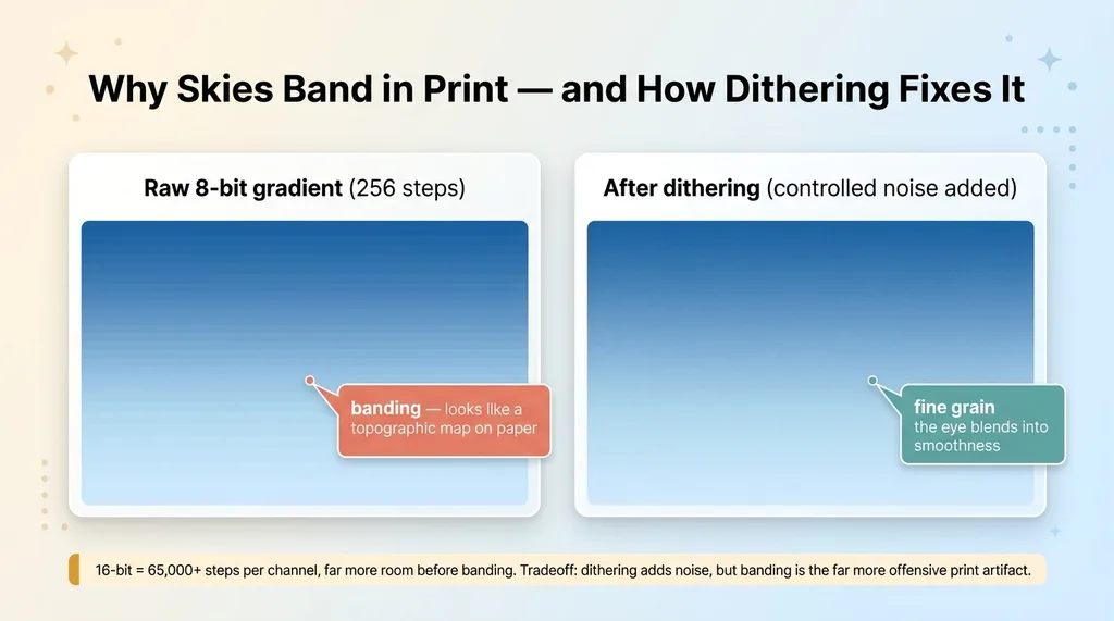
Generated images are almost always 8-bit. That means 256 steps per color channel. On a screen, across a few inches, 256 steps is plenty for a smooth gradient.
 Banding vs dithering on an 8-bit gradient
Stretch that same 8-bit gradient across a large physical print, and you run out of steps. A sky fading from deep blue to pale needs more gradations than 256 to look smooth across 12 inches of paper. So you get banding: visible stair-step lines where the eye expects a seamless transition. Skies, soft backgrounds, glows, vignettes. They're all vulnerable.
Screen hides this because the backlight and pixel density mask the steps. Paper exposes it ruthlessly. My first proof had a sky that looked like a topographic map.
The fix is dithering. You add controlled noise to the gradient before print, which breaks up the hard bands by trading them for fine, imperceptible grain. The eye blends the noise into a smooth transition. It's the same trick that's made digital audio and image dithering work for decades.
Where the source supports it, you can also work in 16-bit, which gives you 65,000+ steps per channel and far more room before banding appears.
Be honest about the tradeoff. Dithering adds noise. It is not free. But in print, banding is the far more offensive artifact. Nobody notices fine grain. Everybody notices stair-steps in a sunset. This is real prepress, not a checkbox you flip once and forget. I tune it per image depending on how much smooth gradient area it has.
Never Let the Model Render Body Text
Do not let the model render text you actually need to read.
AI-rendered text is soft, rasterized, frequently misspelled, and locked to the image resolution. In print, soft text reads as cheap and broken instantly. It's the single fastest way to make a product look fake. And because it's baked into pixels, you can't fix the typo without regenerating the whole image.
The rule: let the model generate imagery, then overlay live vector text in the layout layer.
Vector text stays razor-sharp at any size because it's math, not pixels. It prints crisp at 300+ DPI. It's editable, so you can fix a typo in two seconds. It's spell-checkable. It scales without ever softening.
This connects to a broader principle I keep coming back to: AI shouldn't draw the things that have to be exact. You composite the real thing instead of generating it. Logos, text, product details, anything with a correct answer gets overlaid, not hallucinated.
The practical workflow is straightforward. Generate full-bleed backgrounds and imagery. Reserve clean, low-detail space where text will go (you can prompt for this). Then set the type in your layout tool as live vector. The model handles the part it's good at, the atmosphere and the image, and you handle the part that has to be perfect.
The Full Pipeline, Start to Finish
Here's the whole sequence in order so you have the actual checklist:
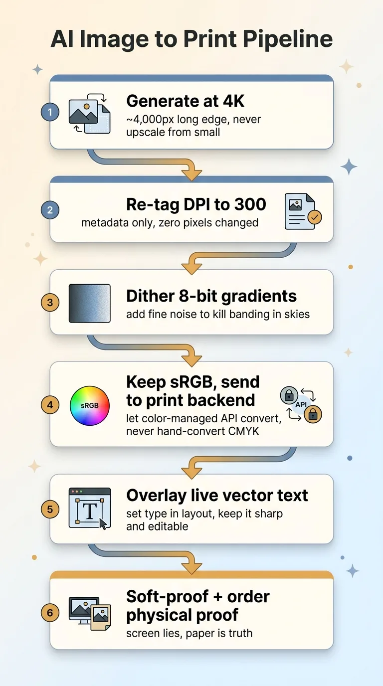 The 6-step AI-to-print pipeline
- Generate full-bleed pages at 4K. Highest tier, never the final trim size, never upscaled from a small render.
- Re-tag DPI metadata to 300. A one-line step that fixes the physical-size lie without touching a pixel.
- Dither the 8-bit gradients. Break up banding in skies, glows, and soft backgrounds before it reaches paper.
- Keep files in sRGB and send to a color-managed print backend or print on demand api. Don't hand-convert to CMYK. Let the backend's profiles and rendering intents handle color for its specific paper and ink.
- Overlay live vector text in layout. Generate imagery, set type separately, keep it sharp and editable.
- Soft-proof, then order a physical proof before the run. Always. Screen lies, profiles approximate, and the only truth is paper in your hand.
The print on demand api is the integration point that matters most for color. A good one accepts sRGB and does the color-managed conversion correctly on its end. That's the whole reason you don't convert yourself: you're handing color to the system that actually knows its own hardware.
This is the honest answer to the buyer's real doubt. AI does not "just work" for physical products. There's a documented pile of prepress rules sitting between a generated image and a sellable artifact, and skipping any one of them produces a proof that comes back wrong. If you want to go deeper, here's more on getting AI images to survive a real printer.
What This Tells You About Building Real Products From AI
Step back from the prepress for a second, because there's a bigger point here.
The gap between a demo that looks great and a product that actually ships is exactly this kind of unglamorous plumbing. The metadata tag. The color management. The dithering. The proofing loop. None of it is impressive in a screenshot. All of it is the difference between a render and revenue.
This is where most AI projects stall. Someone generates a beautiful image, shows it around, everyone's excited, and then it hits the real world and dies on a printer or in a checkout flow or against a color profile. The last 20% is the part nobody demos and the part that's hardest to fake.
In every system I build, that last 20% is the actual work. Across the 15+ AI systems I've put into production, the prepress and the metadata and the edge cases are what made them ship instead of impress. I build the whole pipeline, not the pretty render.
And I'll be straight with you: you only learn these rules by shipping physical artifacts and getting bad proofs back. I learned the DPI tag by having a printer reject my file. I learned dithering from a banded sky. There's no shortcut except scars.
If you want AI producing something physical and sellable, not just a nice image on a screen, this is the work that has to happen. It's the part I'm good at.
Ready to bring AI leadership into your company?
I work with a small number of companies at a time. If you're serious about AI, apply to work together and I'll review your application personally.
Get AI insights for business leaders
Practical AI strategy from someone who built the systems — not just studied them. No spam, no fluff.
Hodgen.AI
Ready to automate your growth?
Book a free 30-minute strategy call with Hodgen.AI.
Book a Strategy Call