AI-Generated Website Hero Beats a 3D Model. Here's Why.
I swapped a fragile 3D trophy for an AI generated website hero plus lightweight motion. It looked better, loaded faster, and didn't break on mobile.
By Mike Hodgen
My First Instinct Was the Flashy Thing (And It Was Wrong)
I was building a consumer site as a personal project, and I wanted a hero section that hit you in the face the second the page loaded. Cinematic. Premium. The kind of thing where a visitor's first reaction is "okay, these people know what they're doing."
So I reached for the flex of the moment: a spinning 3D trophy and a 3D podium, rendered live in the browser. The reasoning felt airtight at the time. 3D reads as modern. 3D reads as expensive. If I wanted the site to feel high-end, real-time 3D was obviously the move.
It wasn't. The thing I eventually shipped was an ai generated website hero built from a single photoreal image and some cheap motion. It looked better, loaded faster, and didn't fall apart on a phone. The 3D version did all three things worse.
I'm telling you this because it's a judgment call story, not a tech tutorial. I'm not going to teach you how to render a trophy in WebGL. The point I want to prove to you, especially if you're the skeptical type who's been burned by vendors selling you the heaviest possible thing, is this: impressive visuals and slow, heavy tech are not the same thing.
People conflate the two constantly. They assume the more technically demanding option must be the better-looking one. That instinct is usually backwards.
I know it's backwards because I built both versions of the same hero. One of them I shipped. The other I deleted after hours of fighting it. Let me walk you through why.
Why the 3D Model Looked Worse Than I Hoped
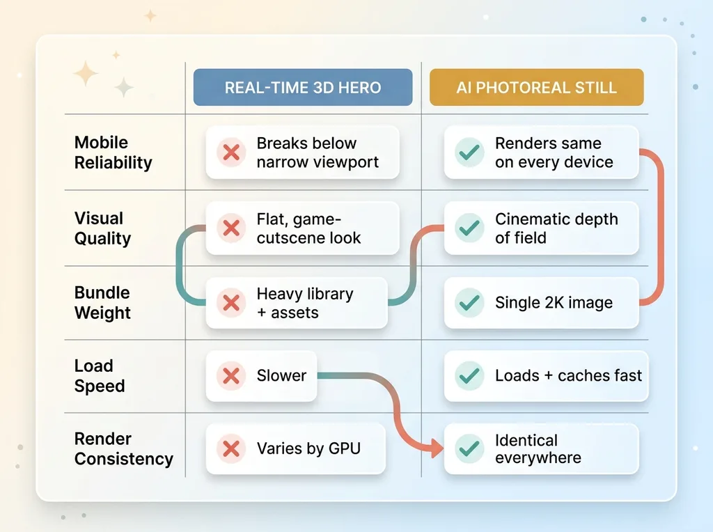 3D Browser Hero vs AI Photoreal Still Comparison
Fragile on mobile
The first crack showed up the moment I shrank the browser window. The 3D trophy and the 3D podium were positioned as separate objects in the scene, and on a narrow viewport they overlapped into a mess. The whole layout fell apart the second the screen got below a certain width.
This is the part nobody shows you in the slick demos. Real-time 3D scenes are built for a specific aspect ratio. Phones don't care about your aspect ratio. A hero that looks great on my 16-inch laptop and breaks on a three-year-old Android is not a finished product. It's a screenshot that happens to move.
Cinematic in my head, flat on screen
The bigger problem was that it just didn't look as good as I'd imagined. In my head, "3D trophy" meant a film-grade frame with dramatic lighting and rich materials. On screen, it looked like a video game cutscene from a decade ago.
That's not a skill issue, or at least not entirely. Real-time 3D in a browser is a compromise rendering. It's not a film frame. The lighting model is simplified, the materials are approximations, and everything is calculated fast enough to hit 60fps on hardware you don't control. You're never getting the cinematic look that way without spending enormous effort.
And it cost real weight. The 3D library plus the model assets added meaningful bundle size for a result that underwhelmed.
I spent hours fighting it. Tweaking lights, repositioning objects, adjusting materials. Eventually I had to admit something uncomfortable: the problem wasn't my execution. The problem was the approach itself.
What I Built Instead: An AI Generated Website Hero
A 2K photoreal stadium from one prompt
I retired all of it. The trophy, the podium, the 3D library, all of it gone.
In its place, I generated a photoreal floodlit stadium with a frontier image model at 2K resolution, plus a separate awards-stage backdrop for another part of the page. One prompt each. This is the same workflow where one AI image call replaced my whole compositing stack, and it produces results that browser 3D simply can't touch on quality.
The stadium image had real depth of field, the kind of light bloom you get from actual floodlights, atmospheric haze in the upper rows. It looked like a photograph because, functionally, it reads like one.
Why a still photo out-performs live 3D
Here's the 3D vs 2D web tradeoff, stated plainly. A photoreal generated still carries detail, depth of field, and lighting that real-time browser 3D can't match without enormous cost. You get the cinematic frame for free, baked into a single asset.
It's also dramatically lighter and more predictable to ship. A 2K image is a known quantity. It loads, it caches, it renders the same on every device. There's no scene to compute, no frame rate to babysit, no GPU to choke.
The thing people miss is what 3D actually buys you: interactivity. The ability to rotate, zoom, manipulate geometry in real time. That's genuinely valuable for a product configurator or a game. It is worthless in a hero section, where the visitor looks for two seconds and scrolls.
I was paying the full price of 3D, the weight, the fragility, the rendering compromise, to get a feature I didn't need. The ai hero image gave me the cinematic look I was actually after and skipped the bill.
The Cheap Motion That Made It Feel Alive
 Layered Motion Stack Anatomy of the AI Hero
Parallax glass cards and a light sweep
A static image alone can feel dead, so I didn't stop at the photo. This is where motion design web earns its keep, and where the approach went from "nice picture" to "this feels premium."
I layered floating glass cards over the scene with subtle parallax, so they drift slightly as you move. Then a slow conic light sweep that travels across the stadium every few seconds, like a roving floodlight catching the haze. Small, slow, deliberate.
None of this requires a 3D engine. It's CSS and a small amount of JavaScript. The parallax is transform math. The light sweep is an animated gradient. Together they cost almost nothing.
Cursor spotlight and dust motes
Then I added two more touches. Drifting dust motes floating through the floodlight beams, which sounds gimmicky but reads as atmosphere. And a lerped cursor spotlight, a soft glow that follows your mouse with a slight lag so it feels weighty instead of snappy.
That lerp matters. A spotlight that tracks your cursor instantly feels cheap and twitchy. One that eases toward the cursor over a few frames feels intentional, like the light has mass.
The combined effect reads as more premium and more alive than the 3D ever did, at a fraction of the cost. That's the whole lesson here. Motion sells presence. You don't need geometry to get it. You need a good still and a handful of lightweight effects that suggest the scene is breathing.
Lite Mode: The Part Most People Skip
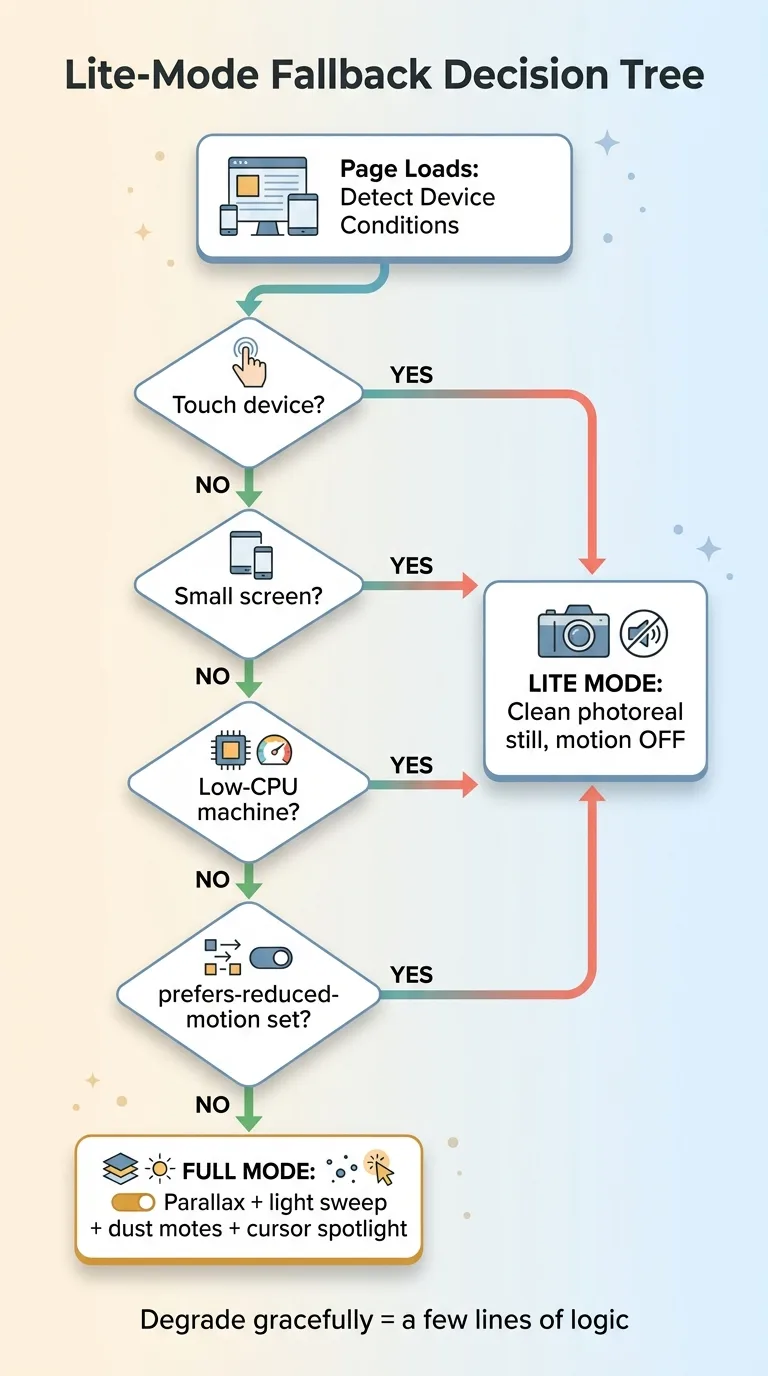 Lite-Mode Fallback Decision Tree
Who gets the stripped-down version
Here's the discipline that separates a finished product from a demo. Every single motion effect is gated behind a lite-mode fallback.
Touch devices get the still image with motion off. Small screens, off. Low-CPU machines, off. Anyone whose browser reports a prefers-reduced-motion preference, off. They all get the clean, photoreal hero without the parallax, the sweep, the motes, or the spotlight.
This is not a nice-to-have. The cursor spotlight is meaningless on a phone because there's no cursor. The dust motes that look great on my laptop can make a budget Android stutter. Shipping all that to a device that can't handle it is how you turn an impressive hero into a broken one.
Respecting reduced-motion and low-CPU
The reduced-motion piece is also just basic respect. Some people get motion sickness or vestibular issues from drifting, sweeping animation. The browser tells you they've asked for less of it. Ignoring that signal to show off your light sweep is a bad trade.
Detecting these conditions is cheap. A media query for reduced motion, a check for touch capability, a rough read on device performance. Degrading gracefully when you find them is a few lines of logic.
Here's the buyer point, because it's the whole game. A fancy hero that tanks on real devices is worse than a plain one. If your impressive build only works on a flagship laptop on fast wifi, you've built a demo, not a product. The judgment to detect the bad conditions and quietly fall back is exactly the kind of thing that gets skipped, and exactly the kind of thing that matters.
The Performance Math: Lighter, Faster, and Better Looking
Let's add it up. The ai hero image plus lightweight motion is lighter than the 3D bundle it replaced. It loads faster. And it looks better. Lighter, faster, and better looking, all three, from the simpler approach.
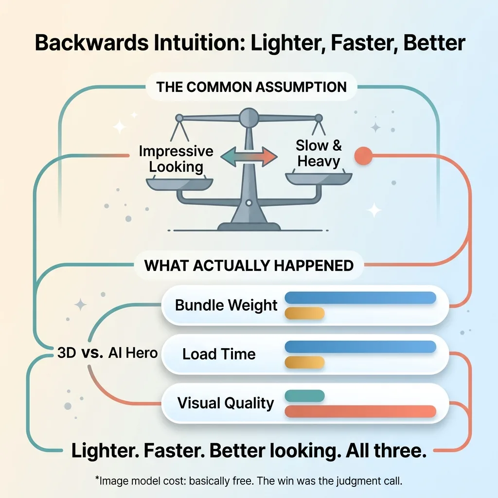 Backwards Intuition: Lighter, Faster, Better
That should bother your intuition a little, and that's the point. Most people assume there's a tradeoff. They think the impressive-looking thing must be the heavy, slow thing, and the fast thing must look plain. So they reach for the heavy option and accept the slowness as the cost of looking good.
That instinct is usually backwards. The 3D version was the heaviest thing I could have shipped, and it looked the worst.
When you measure web performance hero sections, measure the thing that actually matters. That means real-user performance data, not lab scores. A lab test on a fast machine would never have caught the mobile fragility that killed the 3D version. The field data, real people on real phones, tells you the truth.
And here's the kicker on cost. The image model itself is basically free now. Generating that 2K stadium cost me almost nothing. The 3D library was free too. So the win didn't come from a more powerful tool or a bigger budget.
It came from a judgment call. From knowing which tradeoff to make. The value was entirely in picking the simpler approach, and that's not something a more expensive tool gives you.
Impressive Doesn't Mean Heavy (And Knowing the Difference Is the Job)
The most common mistake I see, across every kind of build, is reaching for the heaviest and most technically impressive option because it signals effort. The 3D scene says "we worked hard on this." The static image with clever motion says nothing about effort. It just looks better and runs faster.
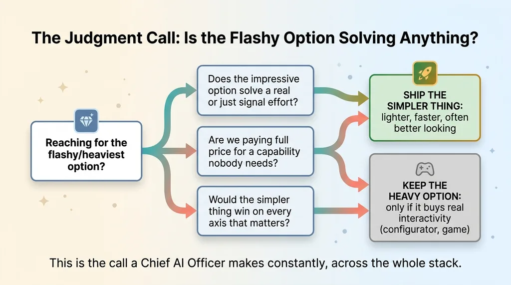 The Judgment Call: Is the Flashy Option Solving Anything?
Buyers and builders both fall for it. The flashy default feels safe because it looks like you tried. But the flashy default is frequently the wrong default, and a lighter, smarter approach beats it on both quality and speed.
This is the judgment a good build actually depends on. Not raw horsepower, not the most advanced tool, not the longest list of technologies. The ability to look at a problem and ask whether the impressive option is solving anything, or just performing effort.
When I work with a company as their Chief AI Officer, this is the call I'm making constantly across their entire stack. Where is the flashy default the wrong default? Where are we paying full price for a capability nobody needs? Where would the simpler thing win on every axis that matters?
If you're staring at a build right now and you're not sure whether you're solving the real problem or just reaching for the shiny version, tell me what you're trying to build. That ambiguity is exactly where I'm useful.
Thinking about AI for your business?
If this resonated, let's talk. I run free 30-minute discovery calls where we look at your actual operations and find the spots where AI could genuinely move the needle, not where it just looks impressive.
No slides, no pitch deck, no vague promises. Just a straight conversation about what you're building and whether the approach you're reaching for is the right one.
Get AI insights for business leaders
Practical AI strategy from someone who built the systems — not just studied them. No spam, no fluff.
Hodgen.AI
Ready to automate your growth?
Book a free 30-minute strategy call with Hodgen.AI.
Book a Strategy Call